Chart (Blazor)
This article demonstrates how to use the Radzen Blazor Chart component. Check also the component guide and API reference.
Using in Radzen
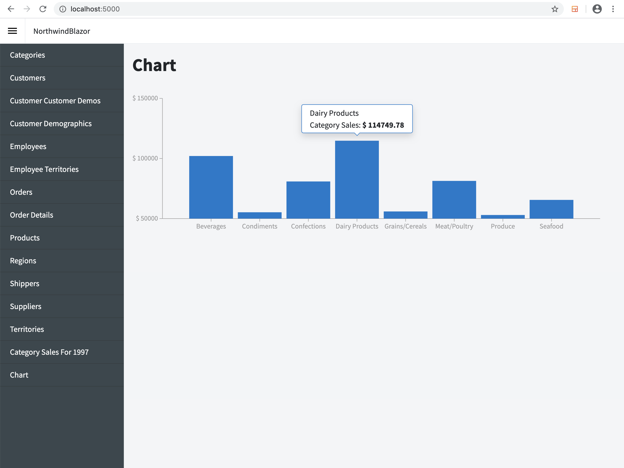
We will create a simple column chart that displays the category sales from the Northwind database (via the Category Sales for 1997 view).
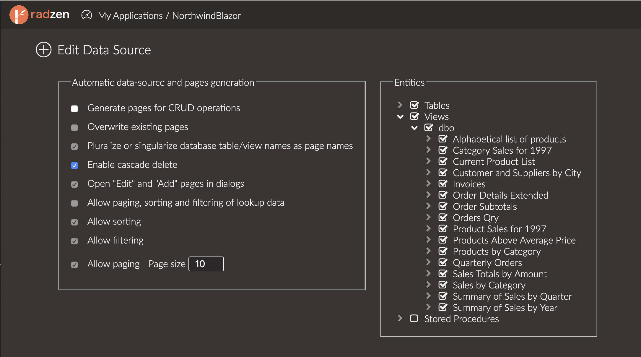
First make sure that you have a MSSQL data source for the Northwind database and it includes that view.
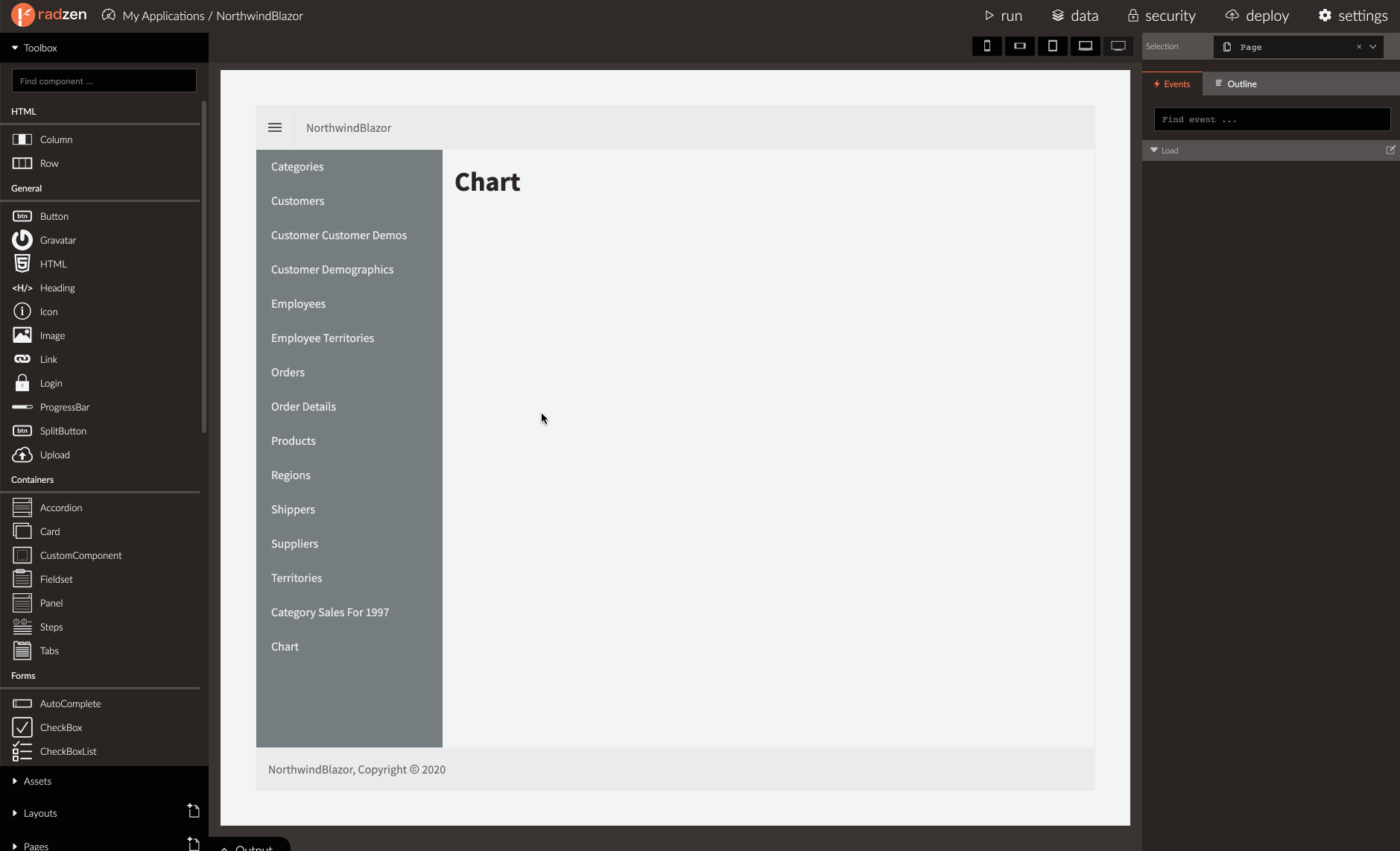
- Create a new page in an existing Radzen Blazor application.
- Drag and drop a Chart component.
- Click the “…” button next to the Series label in the Property Grid.
- Add a new series and set its Type to
Column. - Series need data. Open the Data dropdown and pick “new…”.
- Pick the
getCategorySalesFor1997soperation from the Operations dropdown and click Save. - The series has data. Set CategoryProperty to CategoryName. This means that the X axis of the chart (a.k.a category axis) will display the CategoryName property of the data items.
- Set ValueProperty to
CategorySales. The Y axis (a.k.a. value axis) will use theCategorySalesproperty of the data item. - Finally set the Title property of the series to
Category Sales.
That’s it! Radzen will display a column chart in design time and use some mock data to simulate the runtime appearance.
We can hide the legend since we have only one series. Expand the Legend section in the property grid and uncheck its Visible property.
Also let’s display the Y axis (value) labels as currency. Expand the ValueAxis section in the property grid and set FormatString to $ {0}.
Here is how the final result should look like.
Using from code
The Radzen Blazor Chart can display data as column, line, area and pie series. The chart series needs data and configuration to tell it which property of the data item is the value of the series (Y axis) and which is the category (X axis).
All series have the following common properties:
IEnumerable<T>Data
Specifies the data source which the series should display.
stringValueProperty
The name of the property which provides values for the Y axis of the chart. The property should be of numeric type:
int, long, float, double, decimal.
stringCategoryProperty
The name of the property which provides value for the X axis of the chart. The property can be string, Date or numeric.
If not set the Radzen Chart will use the index of the data item as its X axis value.
Basic usage
Here is a very basic example that creates a column chart with minimal configuration.
<RadzenChart>
  <RadzenColumnSeries Data="@revenue" CategoryProperty="Quarter" ValueProperty="Revenue" />
</RadzenChart>
@code {
  class DataItem
  {
      public string Quarter { get; set; }
      public double Revenue { get; set; }
  }

  DataItem[] revenue = new DataItem[]
  {
      new DataItem
      {
          Quarter = "Q1",
          Revenue = 234000
      },
      new DataItem
      {
          Quarter = "Q2",
          Revenue = 284000
      },
      new DataItem
      {
          Quarter = "Q3",
          Revenue = 274000
      },
      new DataItem
      {
          Quarter = "Q4",
          Revenue = 294000
      }
  };
}
The RadzenColumnSeries tag is used to specify that the chart has a column series. The Data property specifies the
data source. The chart will render a column for every DataItem instance from the revenue array. The Y (value) axis displays
the Revenue property and the X (category) axis displays the Quarter property.
Axis configuration
Min, max and step
By default the Radzen Blazor Chart determines the Y axis minimum and maximum based on the range of values. For example it finds the minimum and maximum values and uses the closes “nice” number. A nice number is usually a multiple of a power of 10: 0, 10, 100, 1000, 200000 etc. In the previous example the chart automatically uses 200000 as the minimum and 300000 as the maximum.
To override the defaults use the Min, Max and Step properties of the RadzenValueAxis tag.
<RadzenChart>
  <RadzenColumnSeries Data="@revenue" CategoryProperty="Quarter" ValueProperty="Revenue" />
  <RadzenValueAxis Min="0" Max="400000" Step="100000" />
</RadzenChart>
Format the values
The value axis displays values with default formatting (ToString()). This can be customized in two ways - via the FormatString or the Formatter properties.
FormatString supports the standard .NET Number formats.
<RadzenChart>
  <RadzenColumnSeries Data="@revenue" CategoryProperty="Quarter" ValueProperty="Revenue" />
  <RadzenValueAxis FormatString="{0:C}"/>
</RadzenChart>
Display grid lines
You can make the chart display grid lines for either the value or category axis.
Add a RadzenGridLines tag inside RadzenValueAxis or RadzenCategoryAxis and set its Visible property to true.
<RadzenChart>
  <RadzenColumnSeries Data="@revenue" CategoryProperty="Quarter" ValueProperty="Revenue" />
  <RadzenValueAxis>
      <RadzenGridLines Visible="true" />
  </RadzenValueAxis>
  <RadzenCategoryAxis>
      <RadzenGridLines Visible="true" />
  </RadzenCategoryAxis>
</RadzenChart>
Set axis title
Use the RadzenAxisTitle tag to display text below the category axis or next to the value axis.
<RadzenChart>
  <RadzenColumnSeries Data="@revenue" CategoryProperty="Quarter" ValueProperty="Revenue" />
  <RadzenValueAxis>
      <RadzenAxisTitle Text="Revenue" />
  </RadzenValueAxis>
  <RadzenCategoryAxis>
      <RadzenAxisTitle Text="Quarter" />
  </RadzenCategoryAxis>
</RadzenChart>
Legend configuration
The Radzen Blazor Chart displays a legend by default. It uses the Title property of the series (or category values for pie series) as items in the legend.
The legend is at the right side of the chart by default. You can change the position of the legend via the Position property.
Legend position
<RadzenChart>
  <RadzenColumnSeries Data="@revenue" CategoryProperty="Quarter" ValueProperty="Revenue" />
  <RadzenLegend Position="LegendPosition.Bottom" />
</RadzenChart>
Hide the legend
To hide the legend set the Visible property to false.
<RadzenChart>
  <RadzenColumnSeries Data="@revenue" CategoryProperty="Quarter" ValueProperty="Revenue" />
  <RadzenLegend Visible="false" />
</RadzenChart>
Tooltip
The Radzen Blazor chart displays a tooltip when the user hovers series with the mouse. The tooltip by default inclused the series category, value and series name.
Customize tooltip content
To customize the tooltip content use the TooltipTemplate setting of the series.
<RadzenChart>
  <RadzenColumnSeries Data="@revenue" CategoryProperty="Quarter" ValueProperty="Revenue">
    <TooltipTemplate Context="data">
      <div>
        Revenue for <span>@data.Quarter</span> 2020:
        <strong>@data.Revenue</strong>
      </div>
    </TooltipTemplate>
  </RadzenColumnSeries>
</RadzenChart>
Disable tooltips
To disable the tooltips set the Visible property of the RadzenChartTooltipOptions tag to false.
<RadzenChart>
  <RadzenColumnSeries Data="@revenue" CategoryProperty="Quarter" ValueProperty="Revenue" />
  <RadzenChartTooltipOptions Visible="false" />
</RadzenChart>
API
RadzenChart
| Name | Type | Description |
|---|---|---|
| ColorScheme | ColorScheme | Specifies the color scheme that the chart series will use. The available color schemes are: Pastel (default), Palette, Divergent, Monochrome. |
| Style | string | Set the inline CSS style. Use to specify width and height e.g. Style="width: 500px; height: 400px" |
RadzenCategoryAxis
| Name | Type | Description |
|---|---|---|
| Stroke | string | The stroke color of the axis. |
| StrokeWidth | double | The width of the axis in pixels. By default set to 1. |
| FormatString | string | Specifies the format string for the axis labels. |
| Formatter | Func<object, string> |
Specifies the formatter function for the axis labels. |
| LineType | LineType | The line type of the axis. One of Solid (default), Dashed, Dotted. |
| Min | object | Specifies the minimum value of the axis. |
| Max | object | Specifies the max value of the axis. |
| Step | object | Specifies the Step value of the axis. If the CategoryProperty is Date pass a TimeSpan. |
| Visible | bool | Show or hide the axis. By default is true unless the chart contains only pie series. |
RadzenValueAxis
| Name | Type | Description |
|---|---|---|
| Stroke | string | The stroke color of the axis. |
| StrokeWidth | double | The width of the axis in pixels. By default set to 1. |
| FormatString | string | Specifies the format string for the axis labels. |
| Formatter | Func<object, string> |
Specifies the formatter function for the axis labels. |
| LineType | LineType | The line type of the axis. One of Solid (default), Dashed, Dotted. |
| Min | object | Specifies the minimum value of the axis. |
| Max | object | Specifies the max value of the axis. |
| Step | object | Specifies the Step value of the axis. |
| Visible | bool | Show or hide the axis. By default is true unless the chart contains only pie series. |
RadzenLineSeries<TItem>
| Name | Type | Description |
|---|---|---|
| Title | string | The title of the series. Displayed in the legend and tooltip. By default automatically generated in the form “Series X” where X is the 1 based index.’ |
| TooltipTemplate | RenderFragment<TItem> |
Specifies the custom tooltip template for that series. |
| CategoryProperty | string | The name of the property of TItem that provides the X axis (a.k.a. category axis) values. |
| ValueProperty | string | The name of the property of TItem that provides the Y axis (a.k.a. value axis) values. |
| Data | IEnumerable<TItem> |
The data source of the series. |
| RenderingOrder | int | Controls the order in which the series will be rendered. Series rendered by ascending RenderingOrder. |
| Stroke | string | The stroke color of the series. |
| StrokeWidth | double | The stroke width of the series in pixels. By default set to 2. |
| LineType | LineType | The line type of the series. One of Solid (default), Dashed, Dotted. |
| Smooth | bool | Specifies whether the line will be smooth or not (default). |
RadzenAreaSeries<TItem>
| Name | Type | Description |
|---|---|---|
| Title | string | The title of the series. Displayed in the legend and tooltip. By default automatically generated in the form “Series X” where X is the 1 based index.’ |
| TooltipTemplate | RenderFragment<TItem> |
Specifies the custom tooltip template for that series. |
| CategoryProperty | string | The name of the property of TItem that provides the X axis (a.k.a. category axis) values. |
| ValueProperty | string | The name of the property of TItem that provides the Y axis (a.k.a. value axis) values. |
| Data | IEnumerable<TItem> |
The data source of the series. |
| RenderingOrder | int | Controls the order in which the series will be rendered. Series rendered by ascending RenderingOrder. |
| Stroke | string | The stroke color of the series. |
| StrokeWidth | double | The stroke width of the series in pixels. By default set to 2. |
| LineType | LineType | The line type of the series. One of Solid (default), Dashed, Dotted. |
| Smooth | bool | Specifies whether the line will be smooth or not (default). |
| Fill | string | The fill color of the series. Used in the area below the line. |
RadzenColumnSeries<TItem>
| Name | Type | Description |
|---|---|---|
| Title | string | The title of the series. Displayed in the legend and tooltip. By default automatically generated in the form “Series X” where X is the 1 based index.’ |
| TooltipTemplate | RenderFragment<TItem> |
Specifies the custom tooltip template for that series. |
| CategoryProperty | string | The name of the property of TItem that provides the X axis (a.k.a. category axis) values. |
| ValueProperty | string | The name of the property of TItem that provides the Y axis (a.k.a. value axis) values. |
| Data | IEnumerable<TItem> |
The data source of the series. |
| RenderingOrder | int | Controls the order in which the series will be rendered. Series rendered by ascending RenderingOrder. |
| Stroke | string | The stroke color of the series. |
| StrokeWidth | double | The stroke width of the series in pixels. By default set to 2. |
| LineType | LineType | The line type of the series. One of Solid (default), Dashed, Dotted. |
| Fill | string | The fill color of the series. Used as the background of the columns. |
RadzenPieSeries<TItem>
| Name | Type | Description |
|---|---|---|
| Title | string | The title of the series. Displayed in the legend and tooltip. By default automatically generated in the form “Series X” where X is the 1 based index.’ |
| TooltipTemplate | RenderFragment<TItem> |
Specifies the custom tooltip template for that series. |
| CategoryProperty | string | The name of the property of TItem that provides the X axis (a.k.a. category axis) values. |
| ValueProperty | string | The name of the property of TItem that provides the Y axis (a.k.a. value axis) values. |
| Data | IEnumerable<TItem> |
The data source of the series. |
| RenderingOrder | int | Controls the order in which the series will be rendered. Series rendered by ascending RenderingOrder. |
| Strokes | IEnumerable<string> |
The stroke colors of the pie segments. |
| StrokeWidth | double | The stroke width of the segments in pixels. By default set to 0. |
| Fills | IEnumerable<string> |
The fill colors of the pie segments. Used as the background of the segments. |
| X | double? | The X of the pie center. Not set by default. The pie is centered horizontally and vertically. |
| Y | double? | The Y of the pie center. Not set by default. The pie is centered horizontally and vertically. |
| Radius | double? | The radius of the Pie. Not set by default. The radius is calculated to fill as much of the chart size as possible. |
RadzenLegend
| Name | Type | Description |
|---|---|---|
| Position | LegendPosition | One of Top, Right (default), Bottom, Left. |
| Visible | bool | Specifies whether the legend is visible (default) or not. |
RadzenTicks
Configure the ticks of RadzenCategoryAxis or RadzenValueAxis.
<RadzenCategoryAxis>
  <RadzenTicks Stroke="green" StrokeWidth="2" />
</RadzenCategoryAxis>
| Name | Type | Description |
|---|---|---|
| Stroke | string | The stroke color of the axis ticks. |
| StrokeWidth | double | The stroke width of the axis ticks in pixels. By default set to 1. |
| LineType | LineType | The line type of the axis ticks. One of Solid (default), Dashed, Dotted. |
RadzenChartTooltipOptions
| Name | Type | Description |
|---|---|---|
| Style | string | Specify custom CSS style for the tooltip. |
| Visible | bool | Specifies whether to show tooltips (default) or not. |
RadzenMarkers
Enables and configures marker rendering for line and area series. Markers are shapes rendered for each item in the series data source.
<RadzenLineSeries Data="@revenue" CategoryProperty="Date" ValueProperty="Revenue">
  <RadzenMarkers MarkerType="MarkerType.Square" />
</RadzenLineSeries>
| Name | Type | Description |
|---|---|---|
| Fill | string | The fill color of the marker. Used as the background. |
| Stroke | string | The stroke color of the marker. Used as the border. |
| StrokeWidth | double | The stroke width of the marker. By default set to 2. |
| Size | double | The size of the marker. By default set to 2. |
| MarkerType | MarkerType | One of None (default), Auto, Triangle, Diamond, Square. When Auto is used the chart will cycle between shapes. |