Accordion (Blazor)
This article demonstrates how to use the Accordion component. Check also the component guide and API reference.
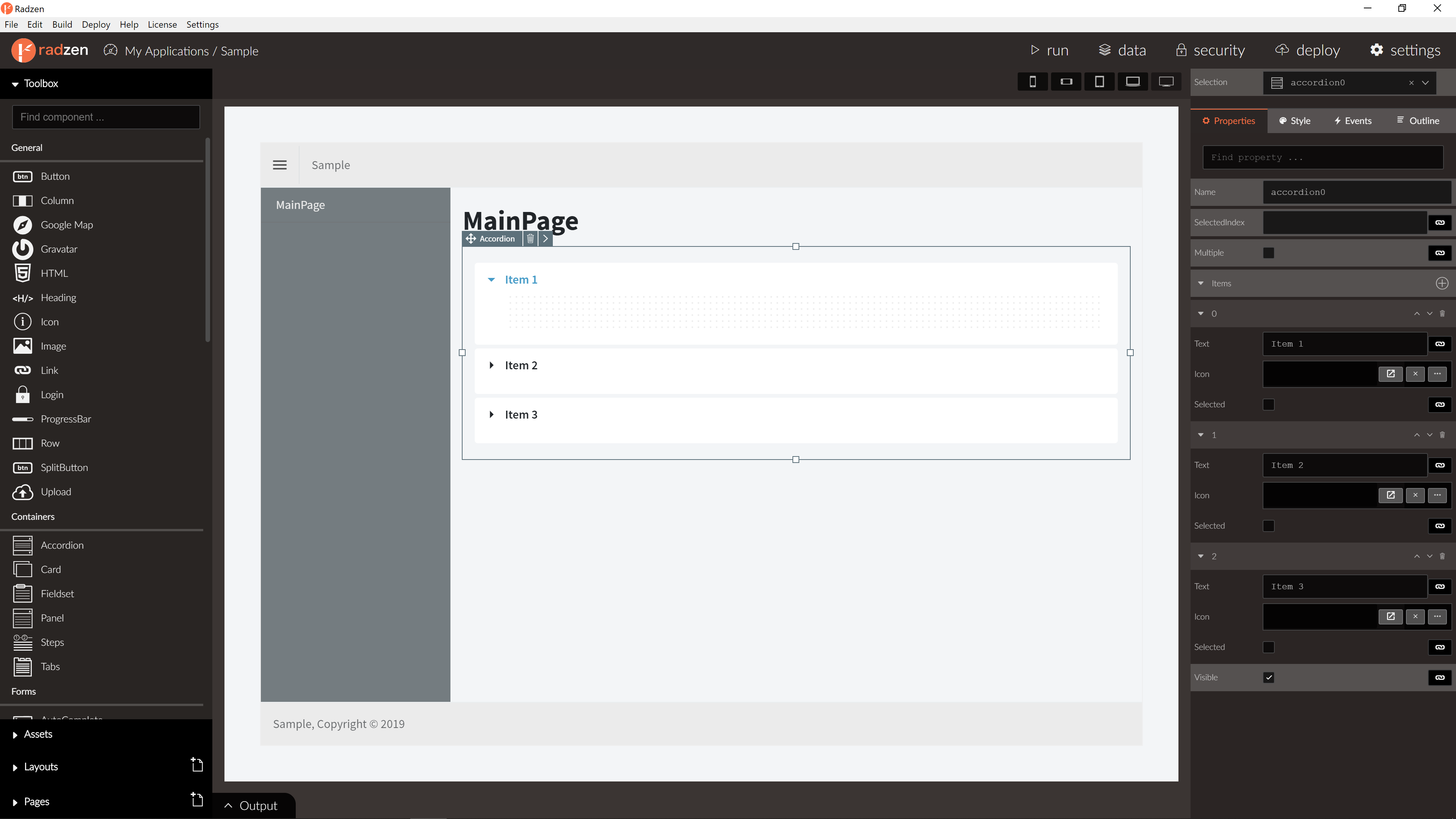
Accordion Properties
| Name | Type | Default | Description | |
|---|---|---|---|---|
| Name | string | ‘accordion’ + index suffix | Unique name the Accordion. | |
| Multiple | boolean | false | Allow multiple items to be expanded. | |
| SelectedIndex | number | 0 | The index of the initially expanded accordion item. | |
| Items | array of Accordion items | One item | Accordion items. | |
| Icon | string | null | Accordion icon. |
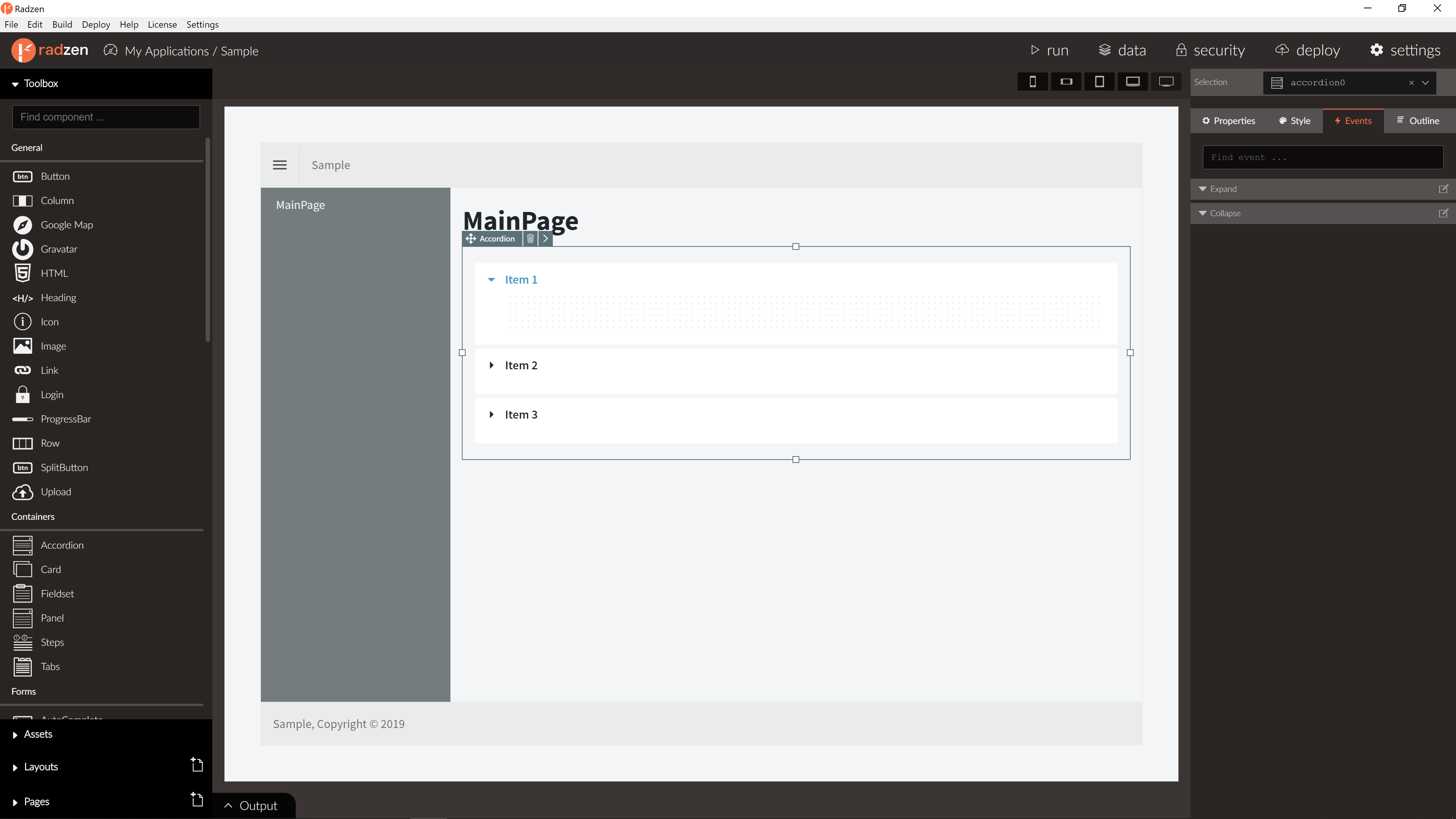
Accordion Events
| Name | Type | Default | Description |
|---|---|---|---|
| Collapse | event | null | Fired when an item collapses. Has one event argument index which is the index of the collapsed item. |
| Expand | event | null | Fired when an item expands. Has one event argument index which is the index of the expanded item. |
Accordion item Properties
| Name | Type | Default | Description |
|---|---|---|---|
| Text | string | string | The header text displayed by the accordion item. |
| Icon | string | null | Accordion item icon. |