Tabs (Blazor)
This article demonstrates how to use the Tabs component. Check also the component guide and API reference.
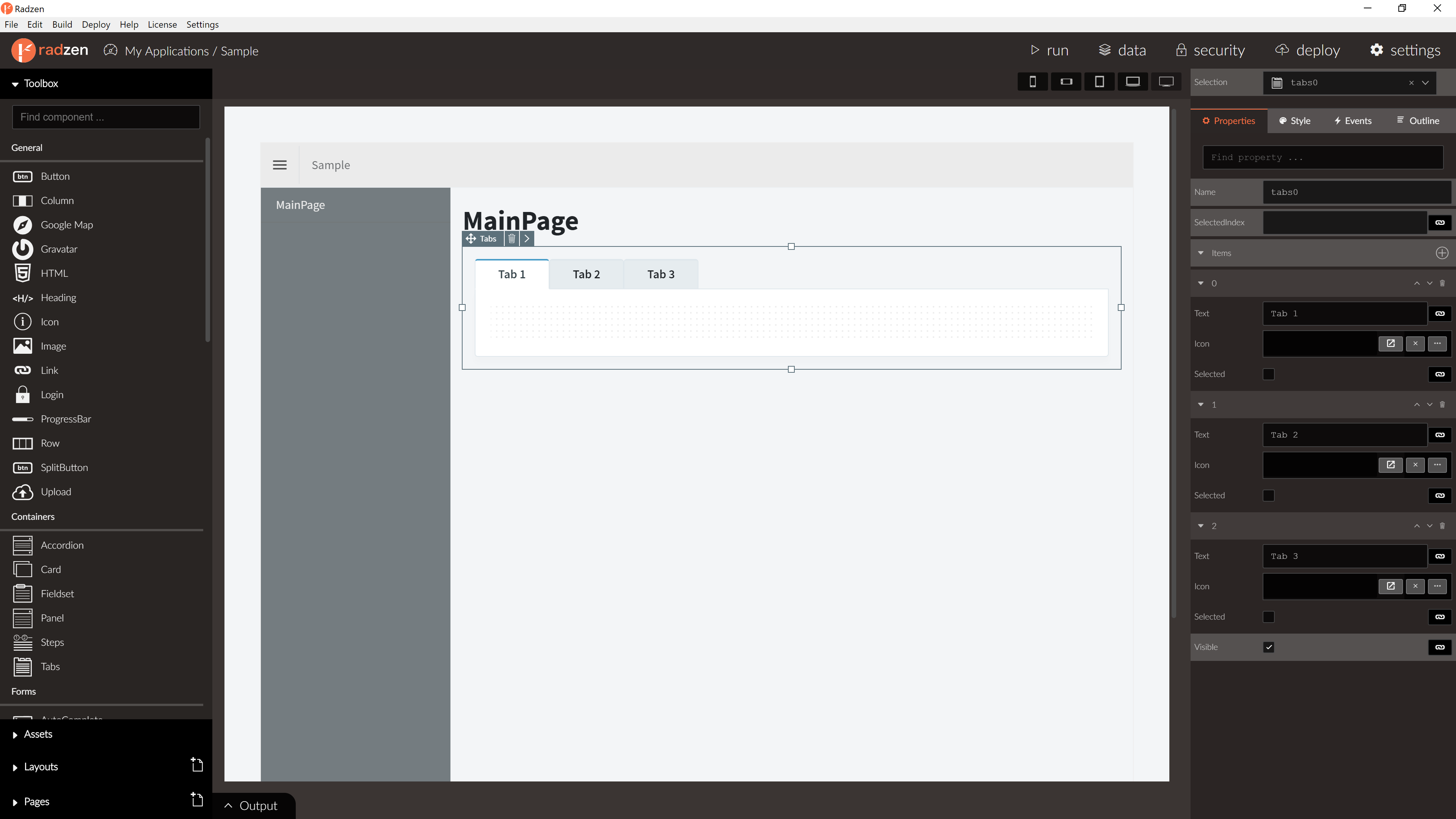
Tabs Properties
| Name | Type | Default | Description |
|---|---|---|---|
| Name | string | ‘tabs’ + index suffix | Unique name the component. |
| SelectedIndex | integer | 0 | The index of the initially selected tab. |
| Items | array of tabs | One item | The tabs which the component displays. |
| Icon | string | null | Tabs icon. |
| RenderMode | enum | Server | Render mode of tabs, Server or Client. |
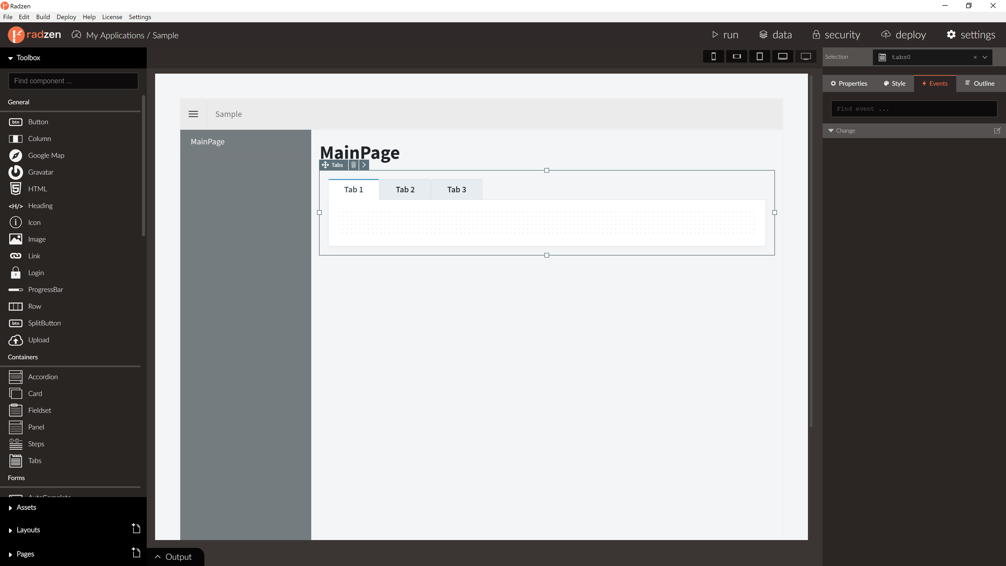
Tabs Events
| Name | Type | Default | Description |
|---|---|---|---|
| Change | event | null | Fired when the selected tab changes. Has one event argument index which is the index of the new tab. |
Tabs item Properties
| Name | Type | Default | Description |
|---|---|---|---|
| Text | string | string | The header text displayed by the tab. |
Blazor declaration
<RadzenTabs>
    <Tabs>
        <RadzenTabsItem Text="Orders">
            ...
        </RadzenTabsItem>
        <RadzenTabsItem Text="Employee">
            ...
        </RadzenTabsItem>
        <RadzenTabsItem Text="Customers">
            ...
        </RadzenTabsItem>
    </Tabs>
</RadzenTabs>