Panel (Blazor)
This guide demonstrates how to use the Panel component. Check also the component guide and API reference.
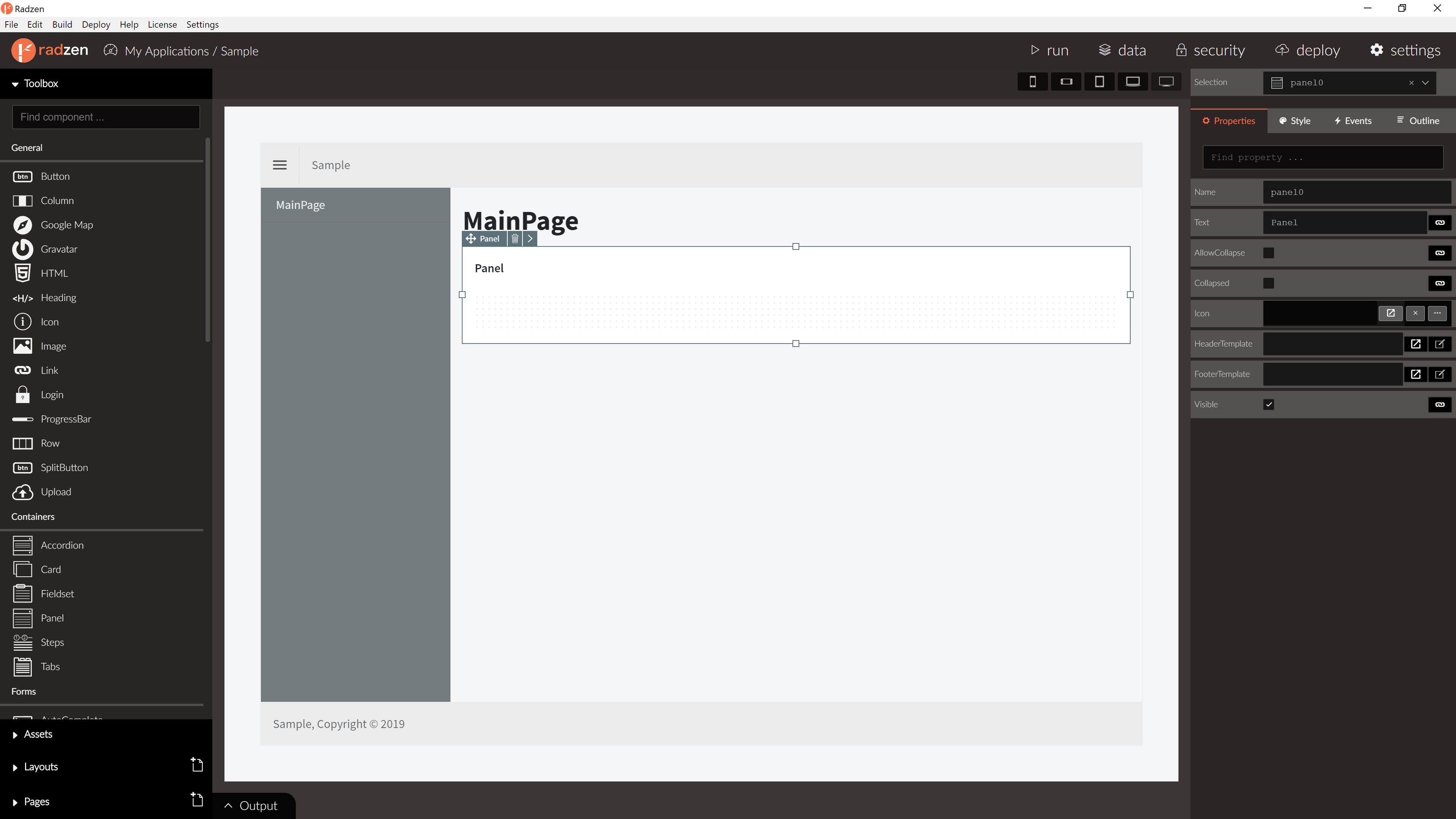
Panel Properties
| Name | Type | Default | Description |
|---|---|---|---|
| Name | string | ‘panel’ + index suffix | Unique name the component. |
| Text | string | ‘Panel’ | The header text displayed by the panel. |
| AllowCollapse | boolean | false | Allow the user to collapse the panel. |
| Icon | string | null | Panel icon. |
| HeaderTemplate | string | null | Panel header template. |
| FooterTemplate | string | null | Panel footer template. |
| Style | string | null | In-line CSS style. |
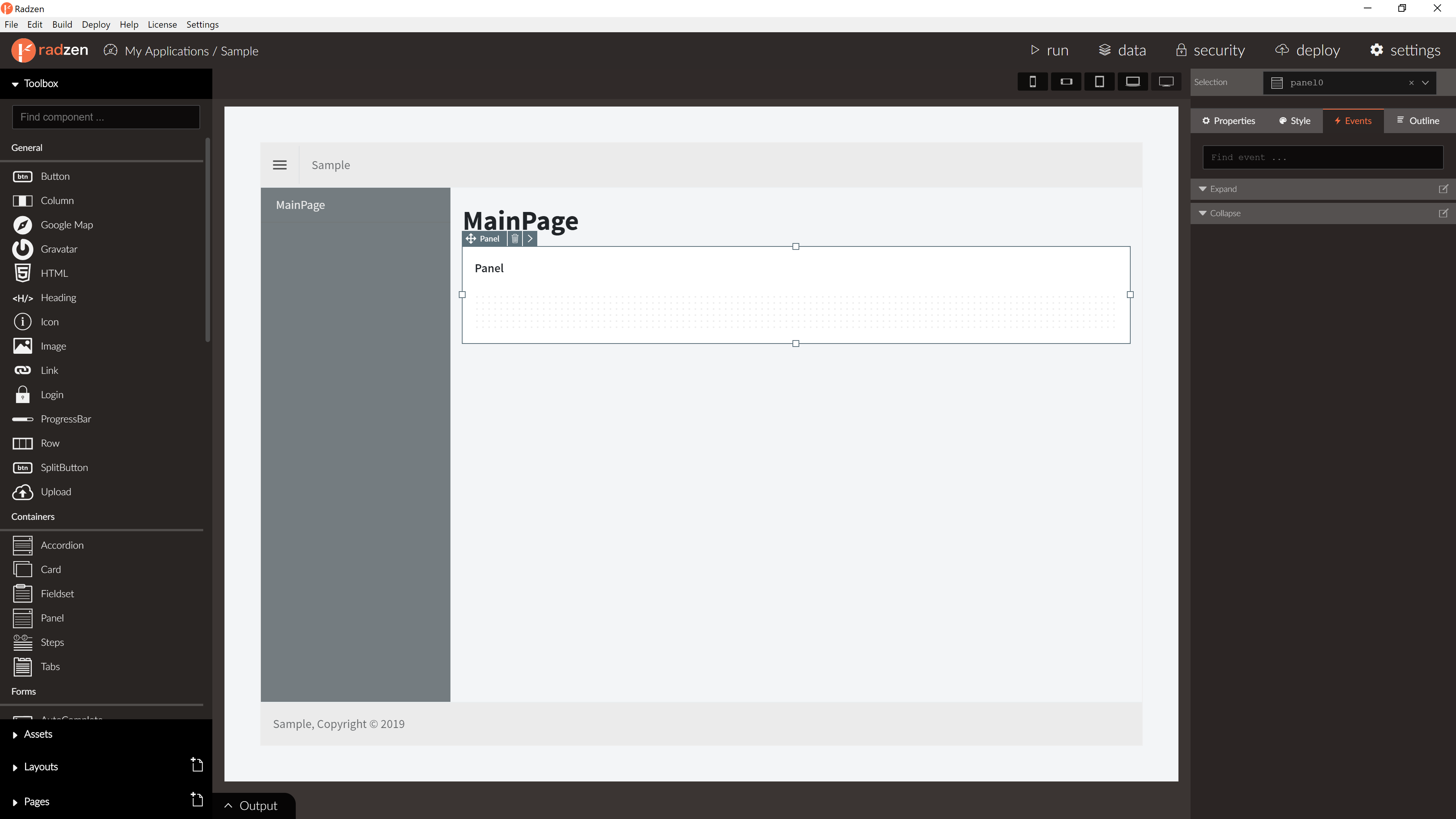
Panel Events
| Name | Type | Default | Description |
|---|---|---|---|
| Collapse | event | null | Fired when the panel collapses. No event arguments. |
| Expand | event | null | Fired when the panel expands. No event arguments. |
Blazor declaration
<RadzenPanel AllowCollapse="true" Expand="@PanelExpanded" Collapse="@PanelCollapsed">
    <HeaderTemplate>
        ...
    </HeaderTemplate>
    <ChildContent>
        ...
    </ChildContent>
</RadzenPanel>