DatePicker (Blazor)
This article demonstrates how to use the DatePicker component. Check also the component guide and API reference.
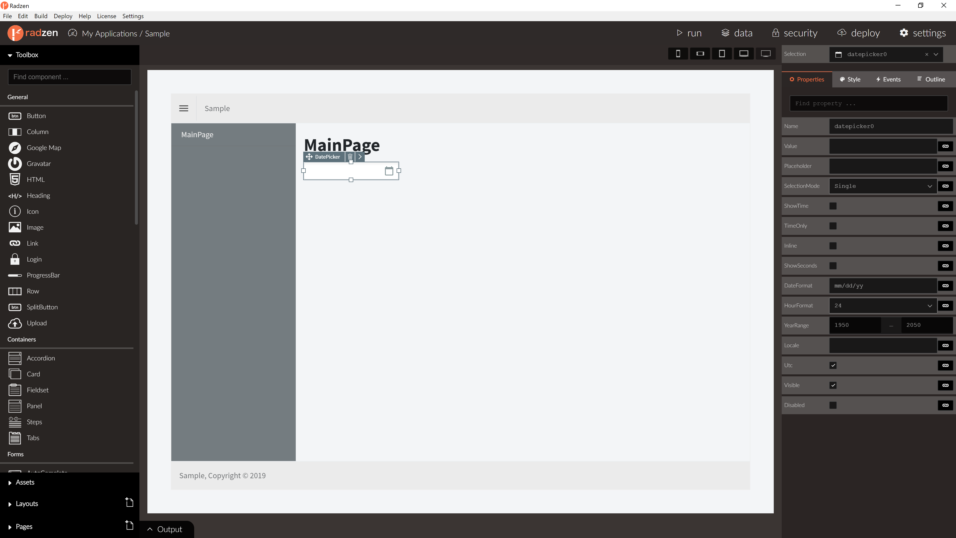
DatePicker Properties
| Name | Type | Default | Description |
|---|---|---|---|
| Name | string | ‘datepicker’ + index suffix | Unique name of the DatePicker. |
| Placeholder | string | empty | DatePicker placeholder. |
| Value | object | null | DatePicker value as DateTime?. |
| Inline | boolean | false | Should show calendar only. |
| TimeOnly | boolean | false | Should show time only. |
| ShowTime | boolean | false | Should show time. |
| ShowSeconds | boolean | false | Should show seconds. |
| ShowTimeOkButton | boolean | true | Should show time part Ok button. |
| Disabled | boolean/expression | false | Is DatePicker disabled. |
| ReadOnly | boolean/expression | false | Is DatePicker read-only. |
| Visible | boolean/expression | true | Is DatePicker visible. |
| Style | string | null | In-line CSS style. |
| DateFormat | string | yyyy-MM-dd | Date format. |
| HourFormat | string | 24 | Hour format. 24 or 12. |
| YearRange | string | 1950:2050 | Year range. |
| HoursStep | number | 1 | Step factor to increment/decrement hours. |
| MinutesStep | number | 1 | Step factor to increment/decrement minutes. |
| SecondsStep | number | 1 | Step factor to increment/decrement seconds. |
DatePicker Events
| Name | Type | Default | Description |
|---|---|---|---|
| Change | event | null | Change event of the DatePicker. Selected date as event argument. |
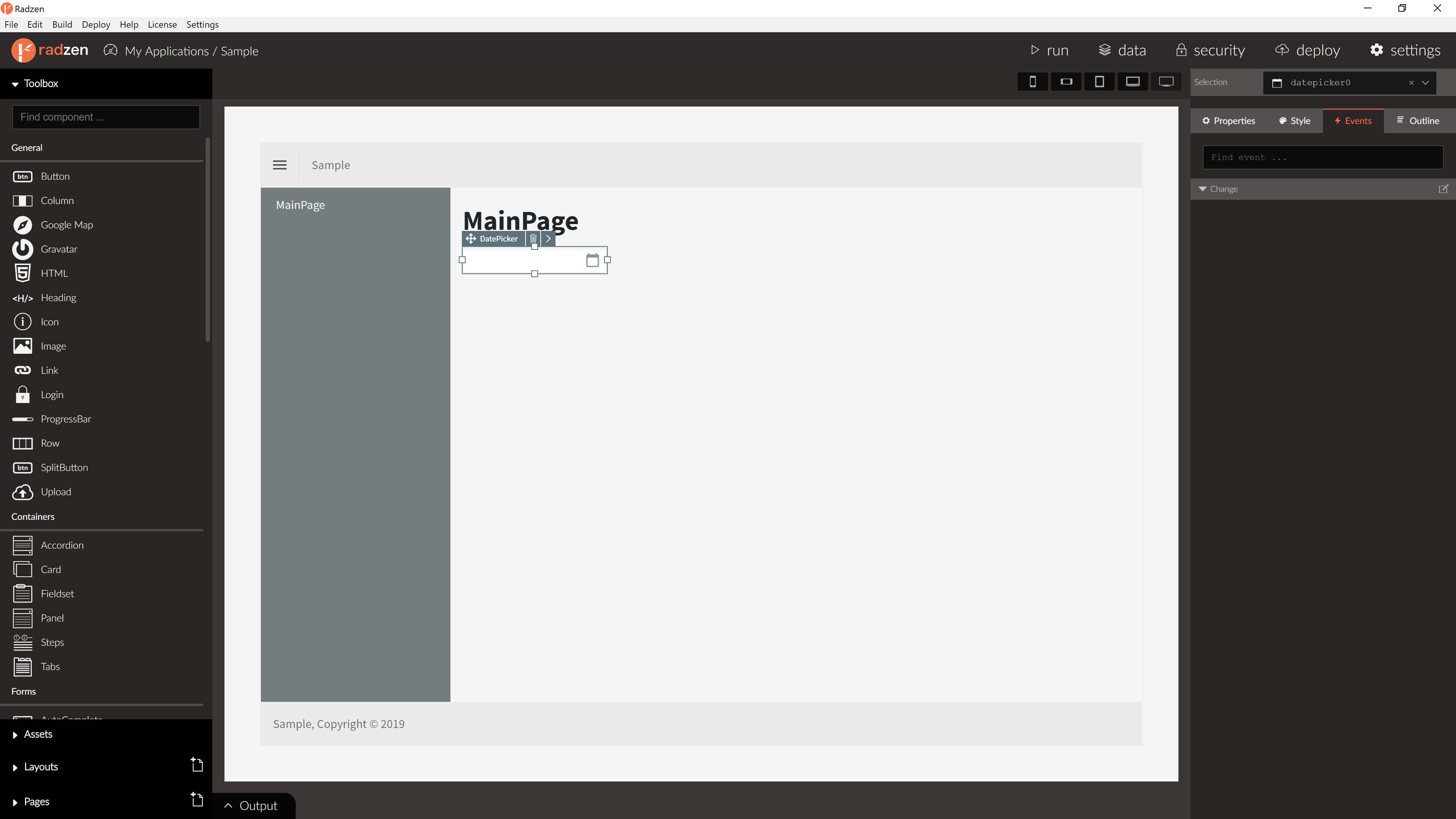
For more info about event actions please visit event actions in our documentation.
Blazor declaration
<RadzenDatePicker ShowTime="true" HourFormat="12" DateFormat="MM/dd/yyyy h:mm tt" Change="@DatePickerChanged" />