Legacy DataGrid (Blazor)
This guide demonstrates how to use the legacy DataGrid component. For more info about our new DataGrid component with new improved rendering, frozen columns, virtualization, etc. please visit new DataGrid component demos.
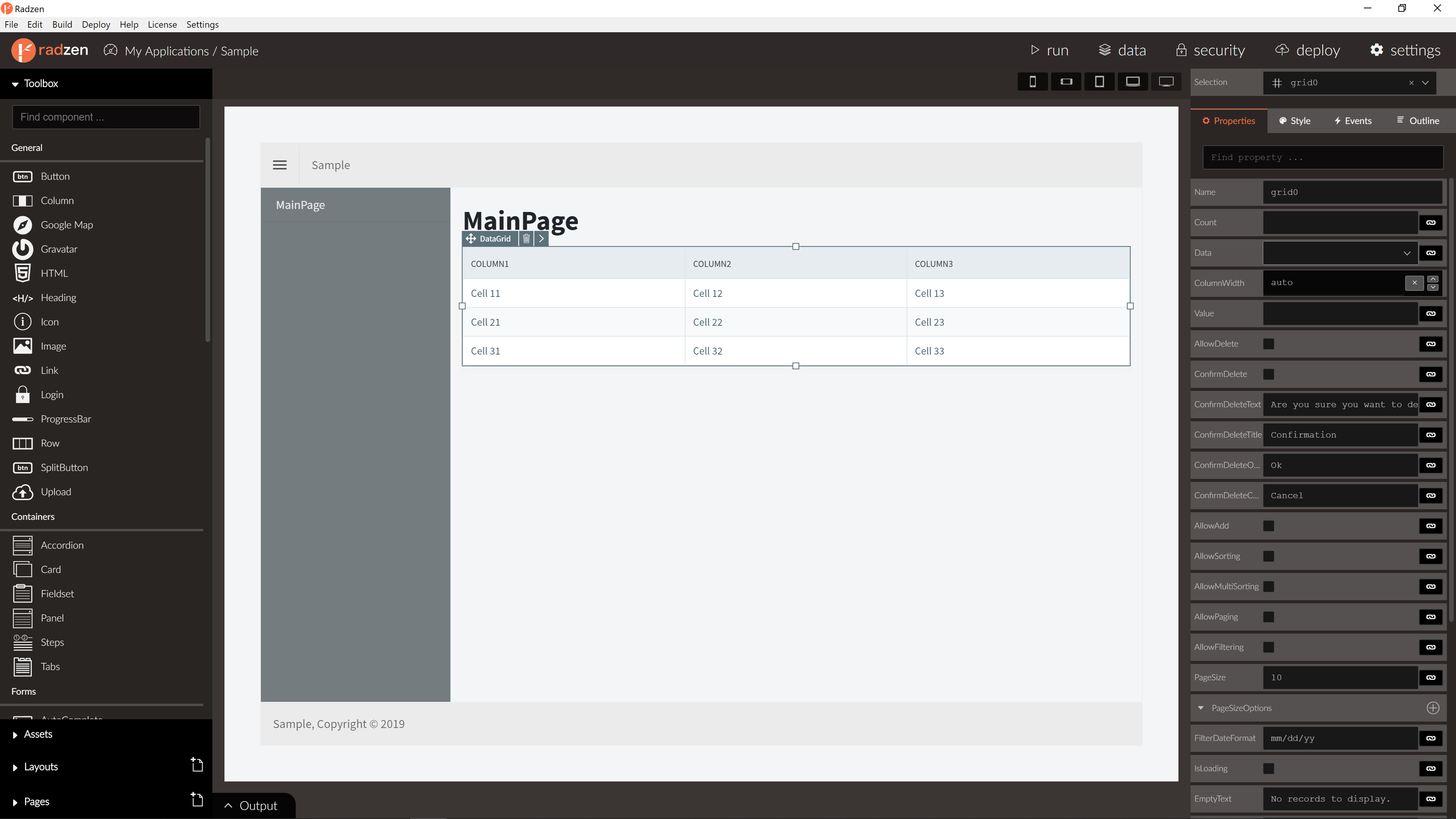
DataGrid Properties
| Name | Type | Default | Description |
|---|---|---|---|
| TItem | type | null | Item type. |
| Data | array | null | DataGrid data. |
| Count | integer | null | DataGrid number of all records. |
| PageSize | integer | 10 | DataGrid number of records per page. |
| AllowPaging | boolean | false | Is paging allowed. |
| AllowSorting | boolean | false | Is sorting allowed. |
| AllowFiltering | boolean | false | Is filtering allowed. |
| Visible | boolean | true | Is DataGrid visible. |
| EmptyText | string | No records to display. | DataGrid text on no records. |
| Columns | array of GridColumn | empty | DataGrid columns. |
| Template | string | null | DataGrid row details template. |
| FilterCaseSensitivity | enum | Default | Default or CaseInsensitive. |
| FilterMode | enum | Simple | Simple or Advanced. |
| FilterDelay | integer | 500 | Number of milliseconds to wait before filter. |
| CurrentPage | integer | 0 | Returns current page index. |
| ApplyFilterText | string | Apply | DataGrid date column filter apply button text. |
| ClearFilterText | string | Clear | DataGrid date column filter clear button text. |
| EqualsText | string | Equals | DataGrid date column filter Equals function text. |
| NotEqualsText | string | Not equals | DataGrid date column filter NotEqualsText function text. |
| LessThanText | string | Less than | DataGrid date column filter LessThanText function text. |
| LessThanOrEqualsText | string | Less than or equals | DataGrid date column filter LessThanOrEqualsText function text. |
| GreaterThanText | string | Greater than | DataGrid date column filter clear GreaterThanText text. |
| GreaterThanOrEqualsText | string | Greater than or equals | DataGrid date column filter GreaterThanOrEqualsText function text. |
| EndsWithText | string | Ends with | DataGrid date column filter EndsWithText function text. |
| ContainsText | string | Contains | DataGrid date column filter ContainsText function text. |
| StartsWithText | string | Starts with | DataGrid date column filter StartsWithText function text. |
| EditMode | enum | DataGridEditMode.Multiple | DataGrid edit mode Single or Multiple. |
| ExpandMode | enum | DataGridExpandMode.Multiple | DataGrid expand mode Single or Multiple. |
| SelectionMode | enum | DataGridSelectionMode.Single | DataGrid selection mode Single or Multiple. |
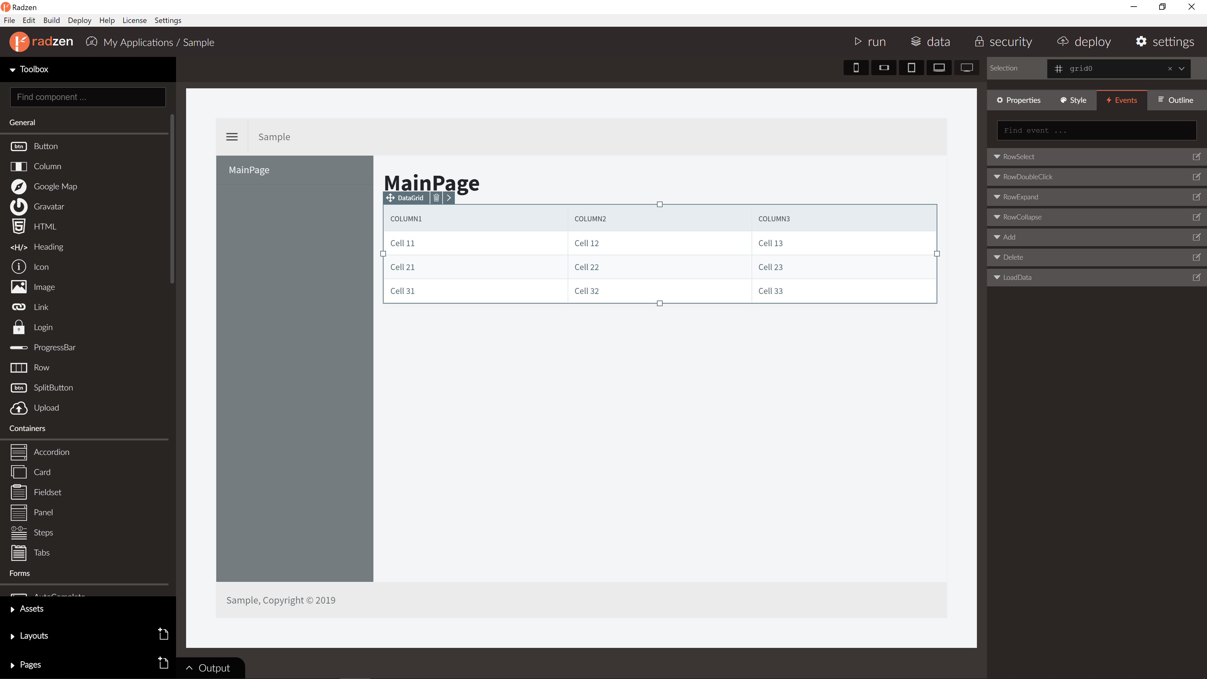
DataGrid Events
| Name | Type | Default | Description |
|---|---|---|---|
| RowSelect | event | null | Row select event of the DataGrid. Fired when row is selected. Row data as event arguments. |
| RowDeselect | event | null | Row deselect event of the DataGrid. Fired when row is deselected. Row data as event arguments. |
| RowDoubleClick | event | null | Row double click event of the DataGrid. Fired when row is double clicked. Row data as event arguments. |
| RowClick | event | null | Row click event of the DataGrid. Fired when row is clicked. Row data as event arguments. |
| RowExpand | event | null | Row expand event of the DataGrid. Fired when row is expanded. Row data as event arguments. |
| RowCollapse | event | null | Row collapse event of the DataGrid. Fired when row is collapsed. Row data as event arguments. |
| LoadData | event | null | Load data event of the DataGrid raised on page, sort and filter with info about the current page, page size, sorted columns and filter expressions |
| RowRender | event | null | Row render event of the DataGrid. |
| CellRender | event | null | Cell render event of the DataGrid. |
| Render | event | null | Render event of the DataGrid. |
DataGrid methods
| Name | Type | Arguments | Description |
|---|---|---|---|
| Reload() | void | N/A | Reloads the data grid. |
| FirstPage() | void | N/A | Sets paging to first page and reloads the data grid. |
| PrevPage() | void | N/A | Sets paging to previous page and reloads the data grid. |
| NextPage() | void | N/A | Sets paging to next page and reloads the data grid. |
| LastPage() | void | N/A | Sets paging to last page and reloads the data grid. |
| GoToPage() | void | int page | Sets paging to specified page and reloads the data grid. |
| EditRow() | Task | TItem item | Sets specified row by data item in edit mode (EditTemplate column property will be rendered for the cell instead Template). RowEdit event will be raised with data item as argument. |
| UpdateRow() | Task | TItem item | Sets specified row by data item in view mode (Template column property will be rendered for the cell instead EditTemplate). RowUpdate event will be raised with data item as argument. |
| CancelEditRow() | void | TItem item | Sets specified row by data item in view mode. |
| IsRowInEditMode() | bool | N/A | Gets if specified row by data item is in Edit mode. |
| ExpandRow() | Task | TItem item | Expand/Collapse specified row by data item. RowExpand/RowCollapse event will be raised with data item as argument. |
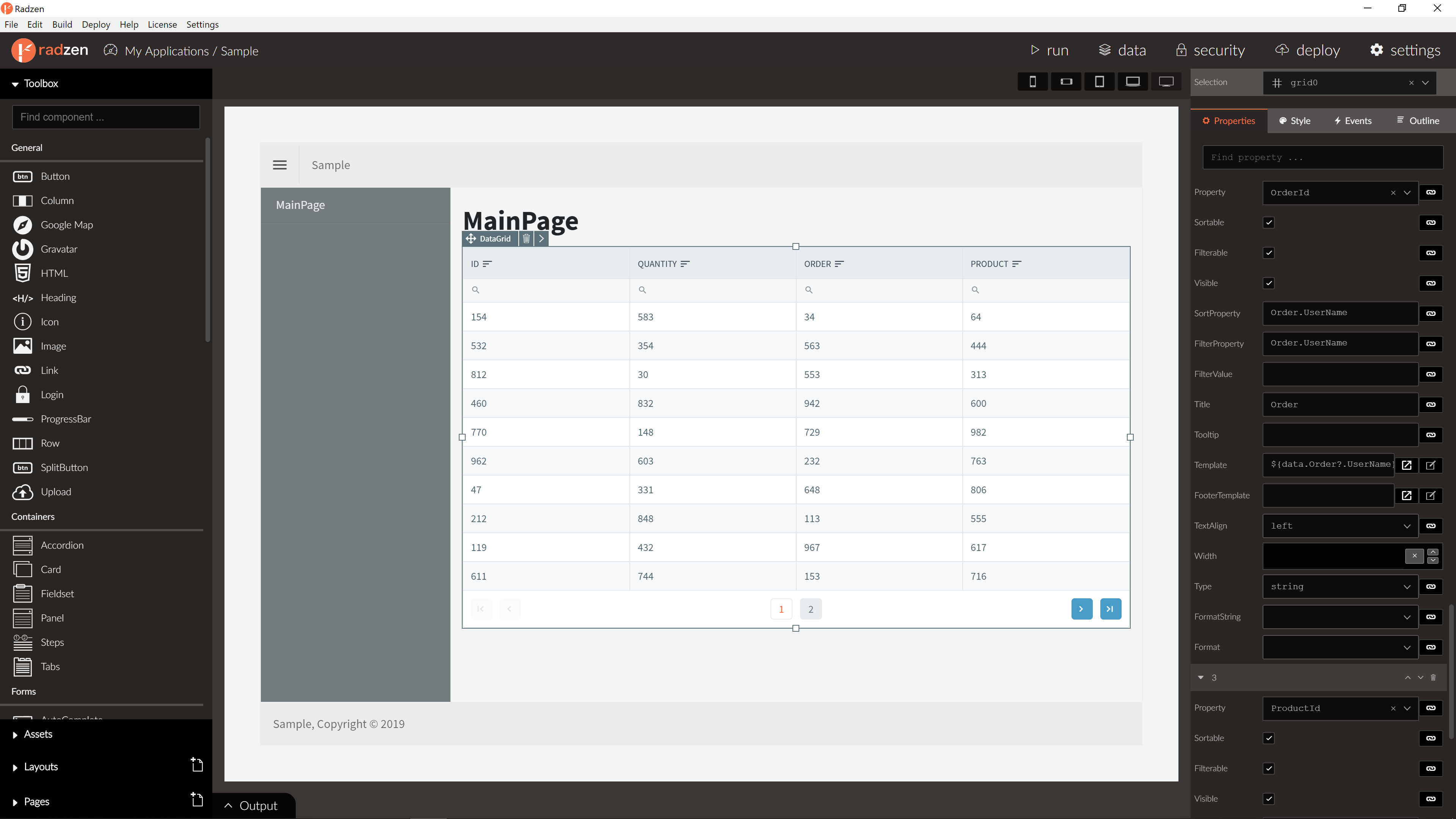
GridColumn Properties
| Name | Type | Default | Description |
|---|---|---|---|
| Type | string | string | GridColumn type. string, integer, number or boolean. |
| Format | string | null | GridColumn format. int32, int64, float, double, byte, binary, base64, date, date-time, date-time-offset or password. |
| Property | string | null | GridColumn property name. |
| SortProperty | string | null | GridColumn sort property name. If not set Property will be used for sorting. |
| FilterProperty | string | null | GridColumn filter property name. If not set Property will be used for filtering. |
| Title | string | null | GridColumn title. |
| Template | string | null | GridColumn template. |
| HeaderTemplate | string | null | GridColumn header template. |
| FooterTemplate | string | null | GridColumn footer template. |
| FormatString | string | null | GridColumn format string. |
| TextAlign | string | null | GridColumn format text align. Default Left. |
| Width | number | null | GridColumn width in pixels. |
| Sortable | boolean | true | Is sorting allowed for this column. |
| Filterable | boolean | true | Is filtering allowed for this column. |
Customizing the column appearance
By default the DataGrid component displays the value of the Property in a column. Use the Template property to customize the appearance. The whole data item is available as data in the expression.
Template examples:
<strong>${data.FirstName}</strong>- display the FirstName property in a<strong></strong>element.<strong>@(data.FirstName)</strong>- display the FirstName property in a<strong></strong>element.Full Name: ${data.FirstName} ${data.LastName}- display two data item properties in the column.Full Name: @(data.FirstName) @(data.LastName)- display two data item properties in the column.
Important: The
${}syntax is specific to Radzen. If you are using the Radzen Blazor components outside of Radzen you have to use the@()syntax.
Blazor declaration
<RadzenGrid @ref="ordersGrid" AllowFiltering="true" AllowPaging="true" PageSize="3" AllowSorting="true"
Data="@orders" TItem="Order" Value="@order">
<Columns>
<RadzenGridColumn Width="200px" TItem="Order" Property="OrderID" Title="Order ID">
<FooterTemplate>
Total orders: <b>@orders.Count()</b>
</FooterTemplate>
</RadzenGridColumn>
<RadzenGridColumn Width="200px" TItem="Order" Property="Customer.CompanyName" Title="Customer" />
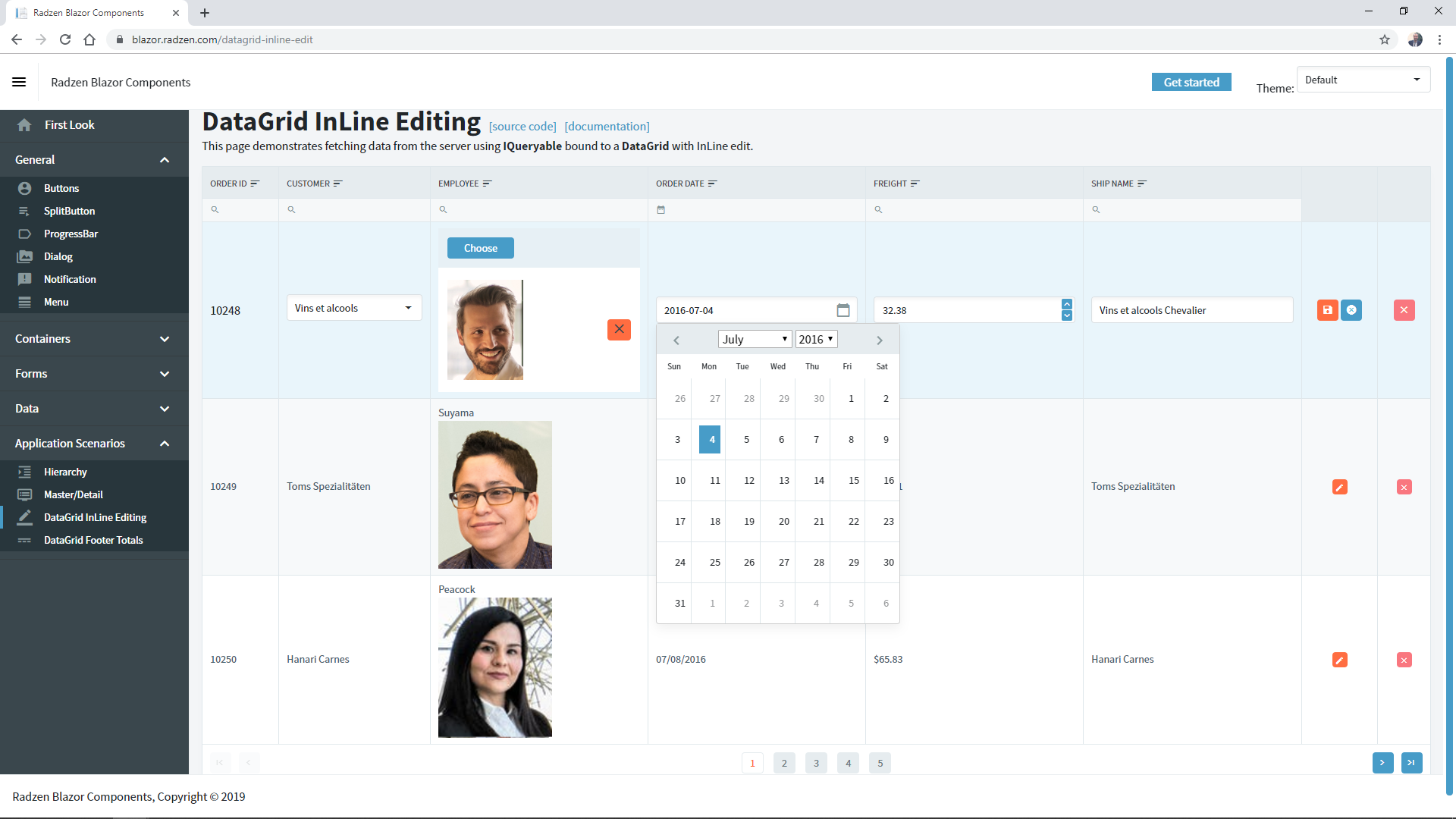
<RadzenGridColumn TItem="Order" Property="Employee.LastName" Title="Employee">
<Template Context="order">
<div>@order.Employee?.LastName</div>
<RadzenImage Path="@order.Employee?.Photo" Style="width:150px" />
</Template>
</RadzenGridColumn>
<RadzenGridColumn TItem="Order" Property="OrderDate" Title="Order Date" Format="date-time">
<Template Context="order">
@String.Format("{0:d}", order.OrderDate)
</Template>
<FooterTemplate>
Last order date: <b>@String.Format("{0:d}", orders.OrderByDescending(o => o.OrderDate).Last().OrderDate)</b>
</FooterTemplate>
</RadzenGridColumn>
<RadzenGridColumn TItem="Order" Property="Freight" Title="Freight">
<Template Context="order">
@String.Format(new System.Globalization.CultureInfo("en-US"), "{0:C}", order.Freight)
</Template>
<FooterTemplate>
Total amount: <b>@String.Format(new System.Globalization.CultureInfo("en-US"), "{0:C}", orders.Sum(o => o.Freight))</b>
</FooterTemplate>
</RadzenGridColumn>
<RadzenGridColumn TItem="Order" Property="ShipName" Title="Ship Name" />
</Columns>
</RadzenGrid>
Server-side operations
-
DataGrid component can perform server-side sorting, paging and filtering when bound to IQueryable (default) or using LoadData event. When generating pages from database, Radzen will create automatically IQueryable service and will set Data property for the DataGrid component.
-
For paging with LoadData event enable paging, add LoadData event handler, call your service with provided information in the event argument and set Data and Count properties to returned values.
Sorting and Filtering by lookup fields
DataGrid component can sort and filter by lookup fields by defining SortProperty and FilterProperty for desired column. When generating pages from database, Radzen will set automatically SortProperty and FilterProperty for all lookup columns based on data-source relations.
InLine edit
DataGrid component can edit and update records using EditRow() and UpdateRow() methods and EditTemplate property of the column. To know more about this feature please visit DataGrid InLine Editing demo.