Slider component (Blazor)
This article demonstrates how to use Slider component. Check also the component guide and API reference.
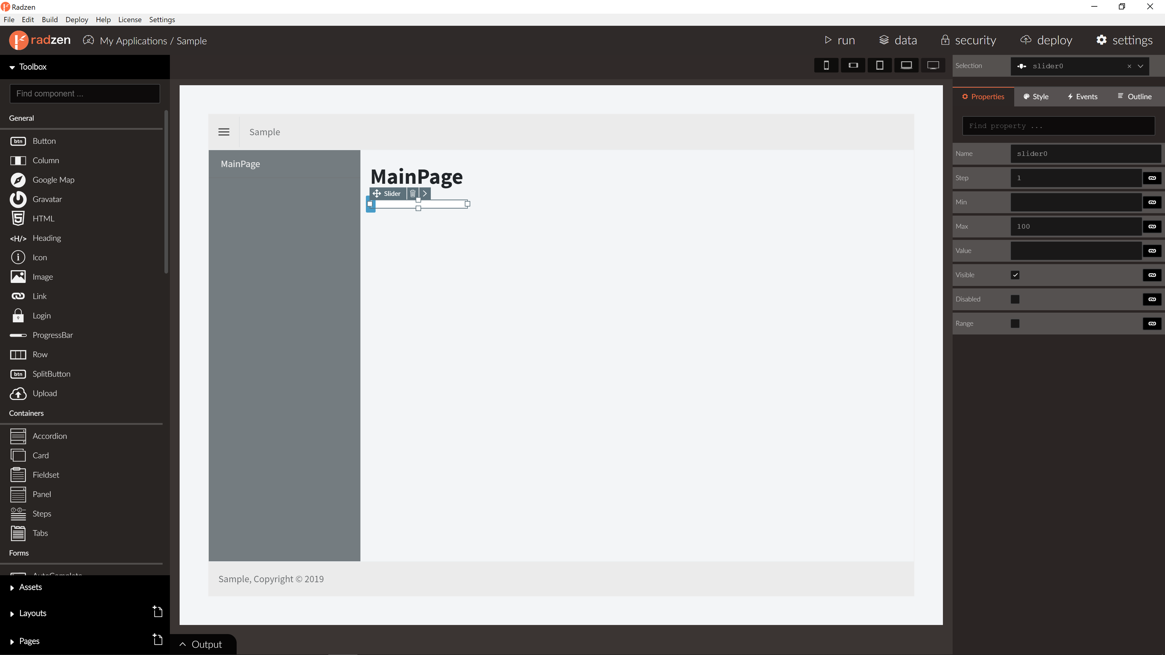
Slider Properties
| Name | Type | Default | Description |
|---|---|---|---|
| Name | string | ‘slider’ + index suffix | Unique name of the Slider. |
| Value | string/expression | null | Slider value. |
| Placeholder | string | empty | Slider placeholder. |
| Disabled | boolean/expression | false | Is Slider disabled. |
| Visible | boolean/expression | true | Is Slider visible. |
| Range | boolean/expression | true | Is range selection allowed. |
| Step | number | 1 | Slider step factor to increment/decrement the value. |
| Min | number | 0 | Slider minimum boundary value. |
| Max | number | 100 | Slider maximum boundary value. |
For more info about expressions please visit expressions in our documentation.
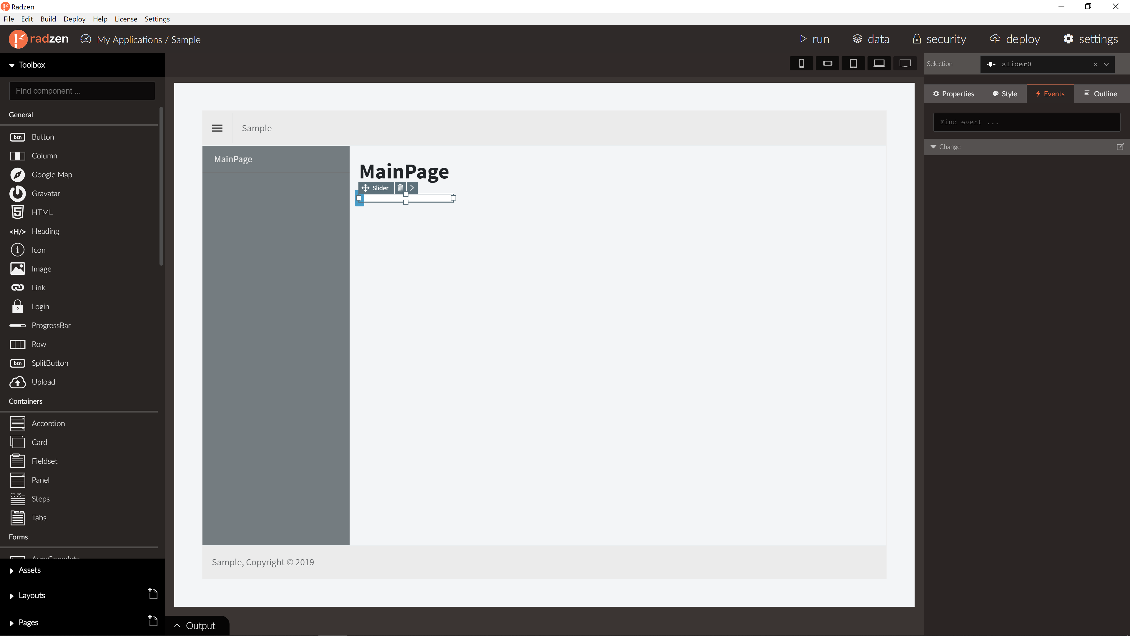
Slider Events
| Name | Type | Default | Description |
|---|---|---|---|
| Change | event | null | Change event of the Slider. New value as event argument. |
For more info about event actions please visit event actions in our documentation.
Blazor declaration
<RadzenSlider Range="true" Name="Slider0" TValue="IEnumerable<int>" Change="@Slider0Change">
</RadzenSlider>