SelectBar (Blazor)
This article demonstrates how to use the SelectBar component. Check also the component guide and API reference.
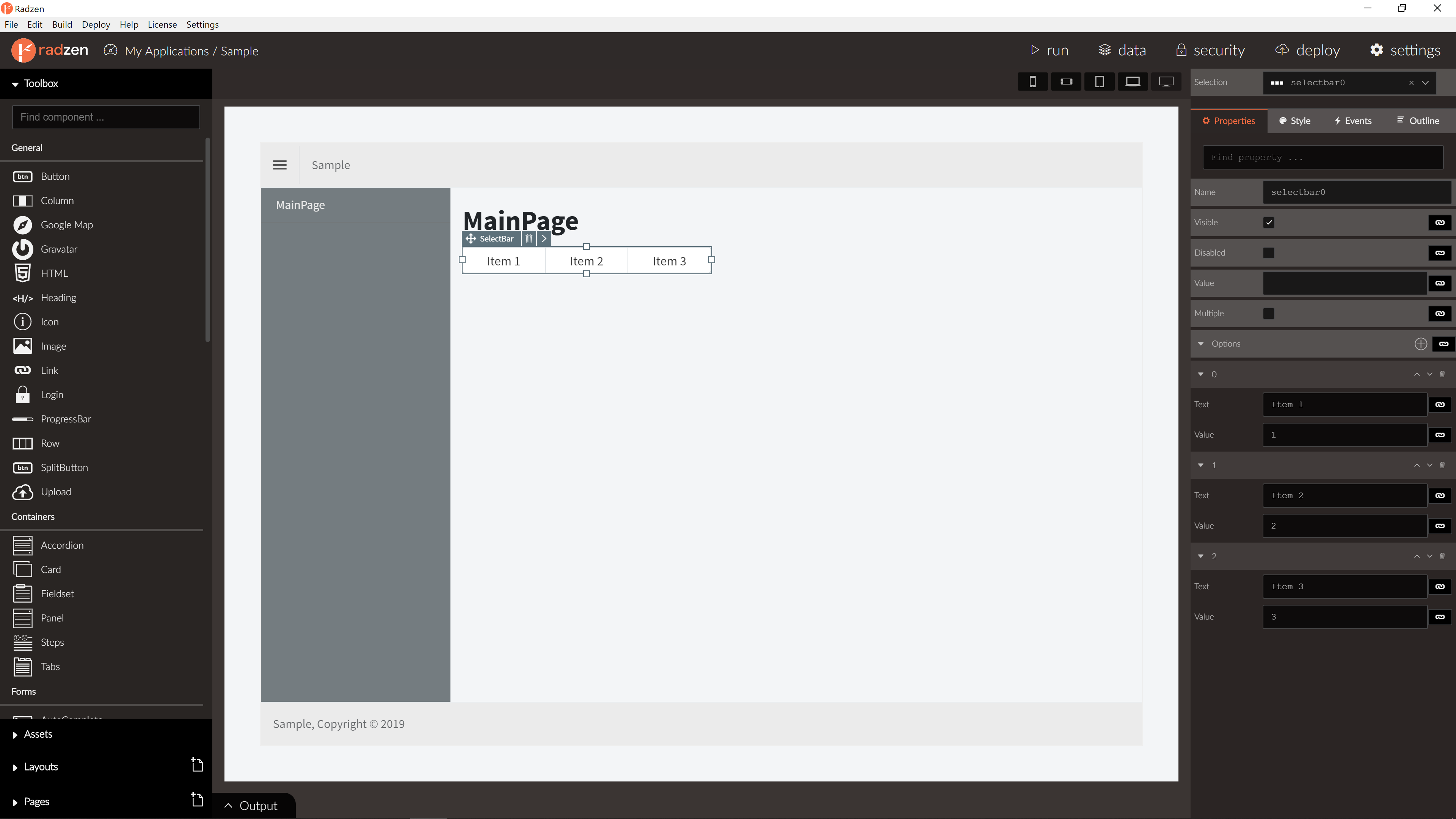
SelectBar Properties
| Name | Type | Default | Description |
|---|---|---|---|
| Name | string | ‘selectbar’ + index suffix | Unique name of the SelectBar. |
| Options | array | null | SelectBar options. |
| Value | string | null | SelectBar value. |
| Multiple | boolean/expression | false | Can select multiple options. |
| Disabled | boolean/expression | false | Is SelectBar disabled. |
| Visible | boolean/expression | true | Is SelectBar visible. |
| Data | array | null | SelectBar data. |
| TextProperty | string | null | SelectBar data text property name. |
| ValueProperty | string | null | SelectBar data value property name. |
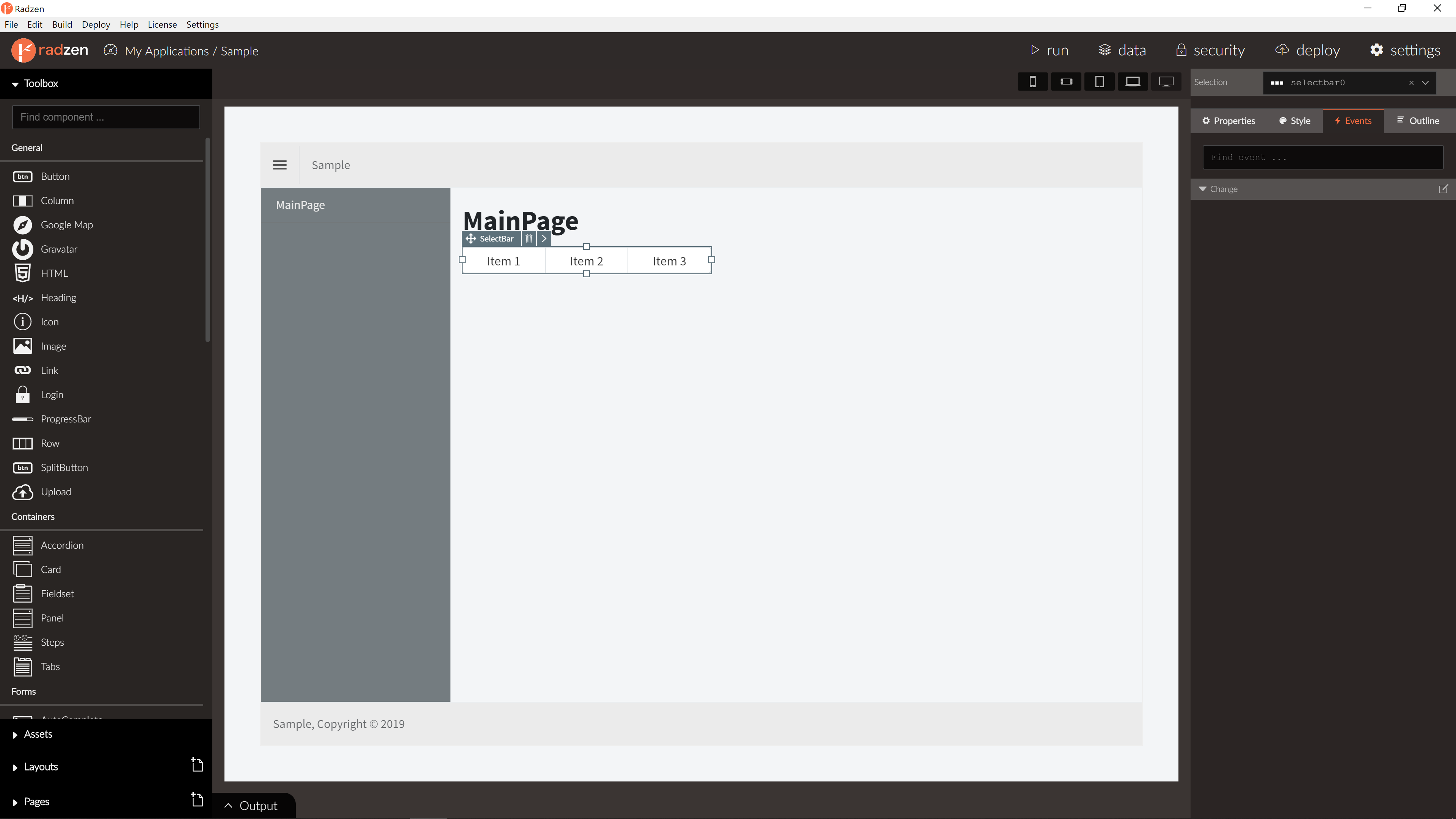
SelectBar Events
| Name | Type | Default | Description |
|---|---|---|---|
| Change | event | null | Change event of the SelectBar. Selected value(s) as event argument. |
For more info about event actions please visit event actions in our documentation.
Blazor declaration
<RadzenSelectBar Multiple="true" Change="@Changed">
    <Items>
        <RadzenSelectBarItem Text="Orders" Value="1" />
        <RadzenSelectBarItem Text="Employees" Value="2" />
        <RadzenSelectBarItem Text="Customers" Value="3" />
    </Items>
</RadzenSelectBar>