Gauge
This guide demonstrates how to use the Radzen Blazor Radial and Arc Gauge components.
Both gauge components are used to display a value (number) on a scale. The share similar configuration - only the way they display their value is different.
The Radial Gauge uses a pointer to “point” where the value is on the scale (similar to a watch). The Arc Gauge fills a portion of the scale with a color (similar to a progress bar).
Using the Radial Gauge in Radzen
Using the gauge componentes from Radzen is quite simple. You just need to drag and drop them and set (or data-bind) some properties.
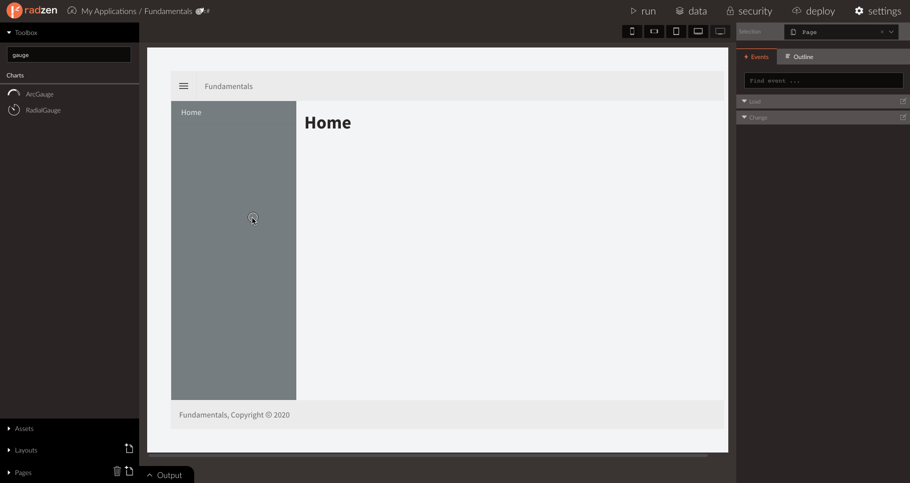
- Create a new page in an existing Radzen Blazor application.
- Drag and drop a Radial Gauge component.
- Expand the Scales section in the Property Grid. You will see that there is one scale already created for you.
- Change any properties of the scale if needed - Min and Max or StartAngle and EndAngle.
- Radial scales need at least one pointer. Click the … button next to the Pointers property. This opens the Pointers editor and allows you to add new pointers or configure the existing ones.
- Set the Value property to a constant value e.g.
50or data-bind it to an existing page property.
That’s it! Radzen will display a column chart in design time and use some mock data to simulate the runtime appearance.
Using the Arc Gauge in Radzen
Using the Arc Gauge is exactly the same. There is only one difference - the scale has a Values property instead of Pointers.
- Create a new page in an existing Radzen Blazor application.
- Drag and drop a Radial Arc component.
- Expand the Scales section in the Property Grid. As with the Radial Gage there will be one scale already created for you.
- Change any properties of the scale if needed - Min and Max or StartAngle and EndAngle.
- Arc scales need at least one value. Click the … button next to the Values property. This opens the Values editor and allows you to add new values or configure the existing ones.
- Set the Value property to a constant value e.g.
50or data-bind it to an existing page property.
Using from code
Here is a very basic example that creates a Radial Gauge with minimal configuration.
<RadzenRadialGauge Style="width: 300px; height: 300px">
  <RadzenRadialGaugeScale>
    <RadzenRadialGaugeScalePoiner Value="50" />
  </RadzenRadialGaugeScale>
</RadzenRadialGauge>
The RadzenRadialGaugeScale tag is used to add a scale and configure its options - min and max value, start and end angle, tick display etc.
the RadzenRadialGaugeScalePointer tag adds and configures a pointer of the RadialGaugeScale it is a child of. The key property here is Value - it specifies the value
the pointer “points” to on the scale.
Here is an equivalent example of Arc Gauge.
<RadzenArcGauge Style="width: 300px; height: 300px">
  <RadzenArcGaugeScale>
    <RadzenArcGaugeScaleValue Value="50" />
  </RadzenArcGaugeScale>
</RadzenArcGauge>
The RadzenArcGaugeScale tag is used to add a scale and configure its options - min and max value, start and end angle, tick display etc.
the RadzenArcGaugeScaleValue tag adds and configures a value of the ArcGaugeScale it is a child of.
Radzen Blazor gauges can have multiple scales and every scale can have multiple pointers or values.
Scale configuration
Min, max and step
By default the Min property of both scale types (Radial and Arc) is set to 0. Max is set to 100 and Step is set to 20.
To override the defaults use the Min, Max and Step properties of the RadzeRadialGaugeScale or RadzenArcGaugeScale tags.
<RadzenArcGauge Style="width: 300px; height: 300px">
  <RadzenArcGaugeScale Min="100" Max="1000" Step="100">
    <RadzenArcGaugeScaleValue Value="50" />
  </RadzenArcGaugeScale>
</RadzenArcGauge>
Tick configuration
By default the RadzenArcGaugeScale does not display ticks. You need to set the TickPosition property to GaugeTickPosition.Outside or GaugeTickPosition.Inside.
To hide the ticks altogether use GaugeTickPosition.None.
<RadzenArcGauge Style="width: 300px; height: 300px">
  <RadzenArcGaugeScale TickPosition="GaugeTickPosition.Outside">
    <RadzenArcGaugeScaleValue Value="50" />
  </RadzenArcGaugeScale>
</RadzenArcGauge>
Minor ticks are not displayed by default. To display them set the MinorStep property to a value greater than 0.
<RadzenArcGauge Style="width: 300px; height: 300px">
  <RadzenArcGaugeScale TickPosition="GaugeTickPosition.Outside" MinorStep="5">
    <RadzenArcGaugeScaleValue Value="50" />
  </RadzenArcGaugeScale>
</RadzenArcGauge>
Change the start and and angles
By default the StartAngle property of the gauge scales is set to -90 and EndAngle is set to 90. This makes
the default shape half a circle. Here is how to create a gauge which is a full circle:
<RadzenRadialGauge>
  <RadzenRadialGaugeScale StartAngle="0" EndAngle="360">
      <RadzenRadialGaugeScalePointer Value="50" />
  </RadzenRadialGaugeScale>
</RadzenRadialGauge>
Format the values
The scale ticks labels displays values with default formatting (ToString()). This can be customized in two ways - via the FormatString or the Formatter properties.
FormatString supports the standard .NET Number formats.
<RadzenRadialGauge Style="width: 300px; height: 300px">
  <RadzenRadialGaugeScale FormatString="{0:C}">
    <RadzenGaugeGaugeScalePointer Value="50" />
  </RadzenGaugeGaugeScale>
</RadzenGaugeGauge>
<RadzenRadialGauge Style="width: 300px; height: 300px">
  <RadzenRadialGaugeScale Formatter=@(value => value.ToString())>
    <RadzenGaugeGaugeScalePointer Value="50" />
  </RadzenGaugeGaugeScale>
</RadzenGaugeGauge>
Change the scale position
You can use the X and Y property of the scales to change the position of their center. Both properties have a default value of 0.5 which means
that by default the center of a scale is the middle of the gauge. X and Y are a multiplier of the width and height.
For example you can move the center of the scale to the bottom of the component by setting Y to 1.
<RadzenRadialGauge Style="width: 300px; height: 300px">
  <RadzenRadialGaugeScale Y="1">
    <RadzenGaugeGaugeScalePointer Value="50" />
  </RadzenGaugeGaugeScale>
</RadzenGaugeGauge>
Using X and Y is also useful when you have multiple scales - this allows you to prevent them from overlapping which they will do by default.
Change the scale radius
By default the radius is set to be half the size of the Gauge - the smaller of its pixel width or height. You can tweak that
by setting the Radius property. It is also a multiplier - the value you specify is multiplied by the initial value (half the width or height depending on which is smaller).
The reason Radius is a multiplier and not an absolute value is responsiveness - users of smaller devices would expect to see a scale which is proportionally the same.
Here is how to make a scale twice as small
<RadzenRadialGauge Style="width: 300px; height: 300px">
  <RadzenRadialGaugeScale Radius="0.5">
    <RadzenGaugeGaugeScalePointer Value="50" />
  </RadzenGaugeGaugeScale>
</RadzenGaugeGauge>
Ranges
The RadzenRadialGaugeScale supports ranges. A range applies a color between two values of the scale. For example this is often used to specify a “dangerous” zone of the scale which a pointer isn’t supposed to go to. A RadzenRadialGaugeScale can have multiple ranges that should not overlap.
<RadzenRadialGauge>
  <RadzenRadialGaugeScale Min="0" Max="260">
    <RadzenRadialGaugeScalePointer Value="50" />
    <RadzenRadialGaugeScaleRange From="0" To="90" Fill="green" />
    <RadzenRadialGaugeScaleRange From="90" To="140" Fill="orange" />
    <RadzenRadialGaugeScaleRange From="140" To="260" Fill="red" />
  </RadzenRadialGaugeScale>
</RadzenRadialGauge>
Radial Gauge pointer configuration
Pointer length
By default a RadialGaugeScalePointer is as long as the radius of its scale. You can controll that via the Length property which is a multiplier with a default value 1.
Here is how to make the pointer half the radius:
<RadzenRadialGauge>
  <RadzenRadialGaugeScale>
    <RadzenRadialGaugeScalePointer Value="50" Length="0.5" />
  </RadzenRadialGaugeScale>
</RadzenRadialGauge>
Hide the pointer value
By default the Value property is displayed below the pointer. You can hide it by setting the ShowValue property to false.
<RadzenRadialGauge>
  <RadzenRadialGaugeScale>
    <RadzenRadialGaugeScalePointer Value="50" ShowValue="false" />
  </RadzenRadialGaugeScale>
</RadzenRadialGauge>
Customize the value display
Use the Template property of the pointer to tweak the default value appearance.
<RadzenRadialGauge>
  <RadzenRadialGaugeScale Min="0" Max="260">
    <RadzenRadialGaugeScalePointer Value=@value>
      <Template Context="pointer">
        <h4>
            @pointer.Value <sup>km/h</sup>
        </h4>
      </Template>
    </RadzenRadialGaugeScalePointer>
  </RadzenRadialGaugeScale>
</RadzenRadialGauge>
Arc Gauge value configuration
Hide the value
By default the Value property is displayed below the scale. You can hide it by setting the ShowValue property to false.
<RadzenArcGauge>
  <RadzenArcGaugeScale>
    <RadzenArcGaugeScaleValue Value="50" ShowValue="false" />
  </RadzenArcGaugeScale>
</RadzenArcGauge>
Customize the value display
Use the Template property of the pointer to tweak the default value appearance.
<RadzenArcGauge>
  <RadzenArcGaugeScale Min="0" Max="260">
    <RadzenArcGaugeScaleValue Value=@value>
      <Template Context="value">
        <h4>
            @value.Value <sup>km/h</sup>
        </h4>
      </Template>
    </RadzenArcGaugeScaleValue>
  </RadzenArcGaugeScale>
</RadzenArcGauge>
API
RadzenRadialGauge
| Name | Type | Description |
|---|---|---|
| Style | string | Set the inline CSS style. Use to specify width and height e.g. Style="width: 500px; height: 400px" |
RadzenRadialGaugeScale
| Name | Type | Description |
|---|---|---|
| Stroke | string | The stroke color of the scale. |
| StrokeWidth | double | The width of scale in pixels. By default set to 1. |
| FormatString | string | Specifies the format string for the scale labels. |
| Formatter | Func<object, string> |
Specifies the formatter function for the scale labels. |
| TickLength | double | Specifies the length in pixels of the ticks. By default set to 10. |
| MinorTickLength | double | Specifies the length in pixels of the minor ticks. By default set to 5. |
| TickLabelOffset | double | Specifies the pixel offset of the label from the tick line. By default set to 25. |
| StartAngle | double | Specifies the start angle of the scale in degrees. By default set to -90. |
| EndAngle | double | Specifies the end angle of the scale in degrees. By default set to 90. |
| TickPosition | GaugeTickPosition | The tick position - none, inside or outside. By default set to GaugeTickPosition.Outside. |
| Radius | double | The scale radius multiplier. By default set to 1. |
| ShowFirstTick | bool | Whether to show the first tick. By default set to true. |
| ShowLastTick | bool | Whether to show the last tick. By default set to true. |
| ShowTickLabels | bool | Whether to show the tick text labelst. By default set to true. |
| X | double | Specifies the horizontal position of the scale center as a multiplier of the gauge width. By default set to 0.5. |
| Y | double | Specifies the vertical position of the scale center as a multiplier of the gauge height. By default set to 0.5. |
| Min | double | Specifies the minimum value of the scale. By default set to 0. |
| Max | double | Specifies the max value of the scale. By default set to 100. |
| Step | double | Specifies the step value of the scale. By default set to 20. |
| MinorStep | double | Specifies the minor step of the scale. By default set to 0 which means that minor ticks are not displayed. |
| Margin | double | Specifies the margin (whitespace) of the scale. By default set to 16. |
RadzenRadialGaugeScalePointer
| Name | Type | Description |
|---|---|---|
| Fill | string | The fill (background) of the pointer. |
| Stroke | string | The stroke color of the pointer. |
| StrokeWidth | double | The stroke width of the pointer in pixels. By default set to 0. |
| Value | double | The value which the pointer points to on the scale. |
| ShowValue | bool | Whether to show the pointer value as a number. By default set to true. |
| Radius | double | The radius of the pointer base in pixels. By default set to 10. |
| Width | double? | The width in pixels of the pointer. By default is half the radius. |
| Length | double | The length of the pointer as a multiplier of the scale radius. By default is 1. |
| FormatString | string | Specifies the format string used to display the pointer value. |
RadzenRadialGaugeScaleRange
| Name | Type | Description |
|---|---|---|
| Fill | string | The fill (background) of the range. |
| Stroke | string | The stroke color of the range. |
| StrokeWidth | double | The stroke width of the range in pixels. By default set to 0. |
| Height | double | The pixel height of the range. By default set to 5. |
| From | double | The start value of the range. Should be between the Min and Max of the parent scale. |
| To | double | The end value of the range. Should be between the Min and Max of the parent scale. |
RadzenArcGauge
| Name | Type | Description |
|---|---|---|
| Style | string | Set the inline CSS style. Use to specify width and height e.g. Style="width: 500px; height: 400px" |
RadzenArcGaugeScale
| Name | Type | Description |
|---|---|---|
| Stroke | string | The stroke color of the scale. |
| StrokeWidth | double | The width of scale in pixels. By default set to 1. |
| FormatString | string | Specifies the format string for the scale labels. |
| Formatter | Func<object, string> |
Specifies the formatter function for the scale labels. |
| Height | double | The height of the scale as a multiplier of the radius. By default set to 0.2. |
| TickLength | double | Specifies the length in pixels of the ticks. By default set to 10. |
| MinorTickLength | double | Specifies the length in pixels of the minor ticks. By default set to 5. |
| TickLabelOffset | double | Specifies the pixel offset of the label from the tick line. By default set to 25. |
| StartAngle | double | Specifies the start angle of the scale in degrees. By default set to -90. |
| EndAngle | double | Specifies the end angle of the scale in degrees. By default set to 90. |
| TickPosition | GaugeTickPosition | The tick position - none, inside or outside. By default set to GaugeTickPosition.None. |
| Radius | double | The scale radius multiplier. By default set to 1. |
| ShowFirstTick | bool | Whether to show the first tick. By default set to true. |
| ShowLastTick | bool | Whether to show the last tick. By default set to true. |
| ShowTickLabels | bool | Whether to show the tick text labelst. By default set to true. |
| X | double | Specifies the horizontal position of the scale center as a multiplier of the gauge width. By default set to 0.5. |
| Y | double | Specifies the vertical position of the scale center as a multiplier of the gauge height. By default set to 0.5. |
| Min | double | Specifies the minimum value of the scale. By default set to 0. |
| Max | double | Specifies the max value of the scale. By default set to 100. |
| Step | double | Specifies the step value of the scale. By default set to 20. |
| MinorStep | double | Specifies the minor step of the scale. By default set to 0 which means that minor ticks are not displayed. |
| Margin | double | Specifies the margin (whitespace) of the scale. By default set to 16. |
RadzenArcGaugeScaleValue
| Name | Type | Description |
|---|---|---|
| Fill | string | The fill (background) of the pointer. |
| Stroke | string | The stroke color of the pointer. |
| StrokeWidth | double | The stroke width of the pointer in pixels. By default set to 0. |
| Value | double | The value which the pointer points to on the scale. |
| ShowValue | bool | Whether to show the pointer value as a number. By default set to true. |
| Width | double? | The width in pixels of the pointer. By default is half the radius. |
| FormatString | string | Specifies the format string used to display the pointer value. |