TemplateForm (Blazor)
This article demonstrates how to use the TemplateForm component. Check also the component guide and API reference.
TemplateForm Properties
| Name | Type | Default | Description |
|---|---|---|---|
| Name | string | ‘templateForm’ + index suffix | Unique name of the Form. |
| Visible | boolean/expression | true | Is the TemplateForm visible. |
| TItem | type | null | Data property type. |
| IsValid | boolean | false | Returns if form is valid or not. |
For more info about expressions please visit expressions in our documentation.
TemplateForm Events
| Name | Type | Default | Description |
|---|---|---|---|
| Submit | event | null | Submit event of the Form. Object with changed property values as event argument. |
| InvalidSubmit | event | null | Object with Errors as event argument. |
Important!!! In order for the Submit event to trigger the TemplateForm should contain at least one Button component whose
ButtonTypeproperty is set tosubmit.
For more info about event actions please visit event actions in our documentation.
Using the TemplateForm
The TemplateForm contains by default only a submit button which can be removed. Input components (TextBox, DropDown et. al) are used to get the user input.
Unbound TemplateForm
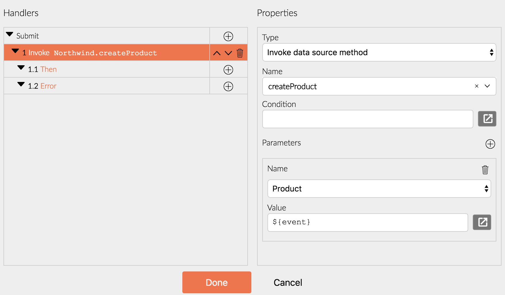
Unbound TemplateForm is used when creating new data items. Then the form data is obtained via the Submit event argument. It contains the value of every input component whose Name property is set. Here is an example.
- Drag-and-drop a TemplateForm component from the Radzen toolbox.
- Add a Row component above the submit button. Set its bottom margin to
16pxto add some vertical spacing. Add two Columns in it. Set the size of the first column to3and the size of the second column to9.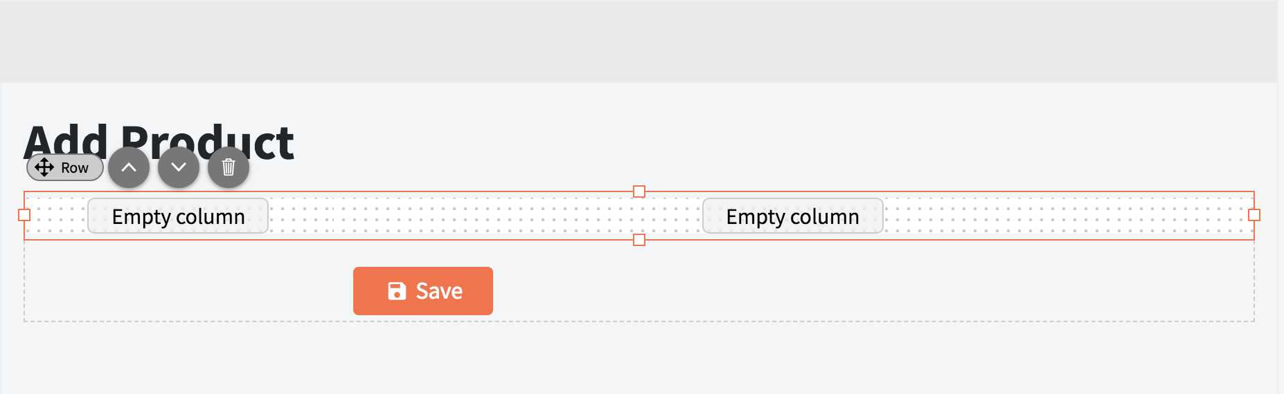
- Drag-and-drop a TextBox component in the second column. Set the TextBox Name property to
ProductName. This textbox will capture the product name of a hypothetical product item. The value will be available asProductNamein the Submit event argument.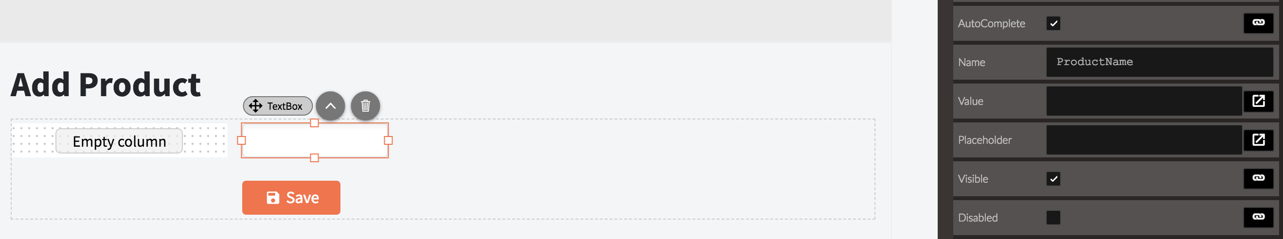
- Drag-and-drop a Label component in the first column. Set its Text property to
Product Nameand Component toProductName. This will “link” the label with the textbox created in the previous step - when the user clicks the label the textbox will automatically focus.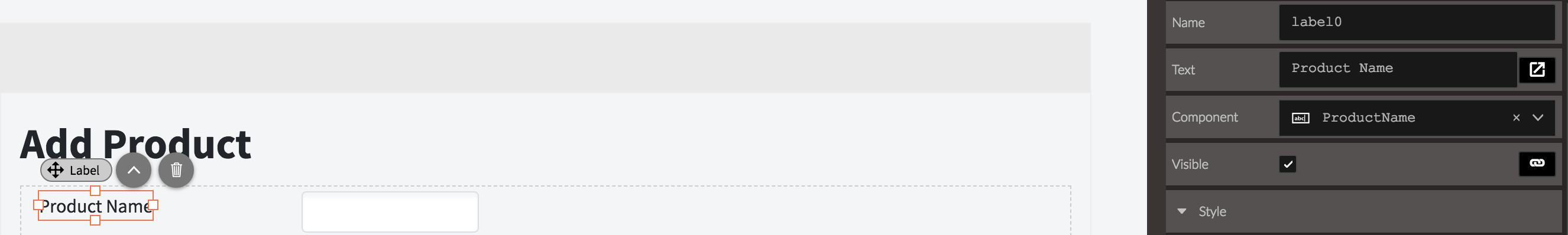
- Drag-and-drop a RequiredValidator component after the textbox. Set its Text property to
Product Name is requiredand Component toProductName. The required validator will make sure the user enters a ProductName. If she doesn’t the Submit event of the form will not trigger and the Text of the validator will display.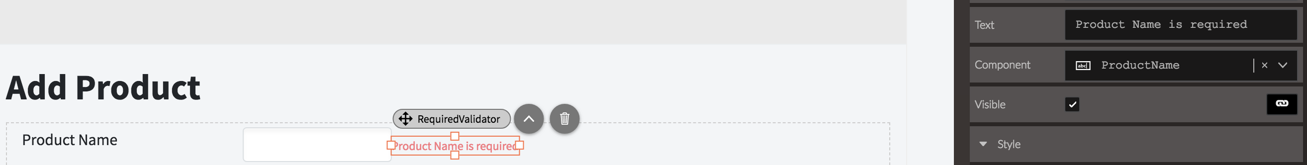
- Add an event handler for the Submit event. Optionally invoke a data source method that will insert a new entity.
Data-bound TemplateForm
Data-bound TemplateForm is used when updating existing data items or when one needs to specify default values. In this case the input components are data-bound - their Value property is set e.g. ${data.ProductName}.
- Add a handler of the page Load event and retrieve a data item.
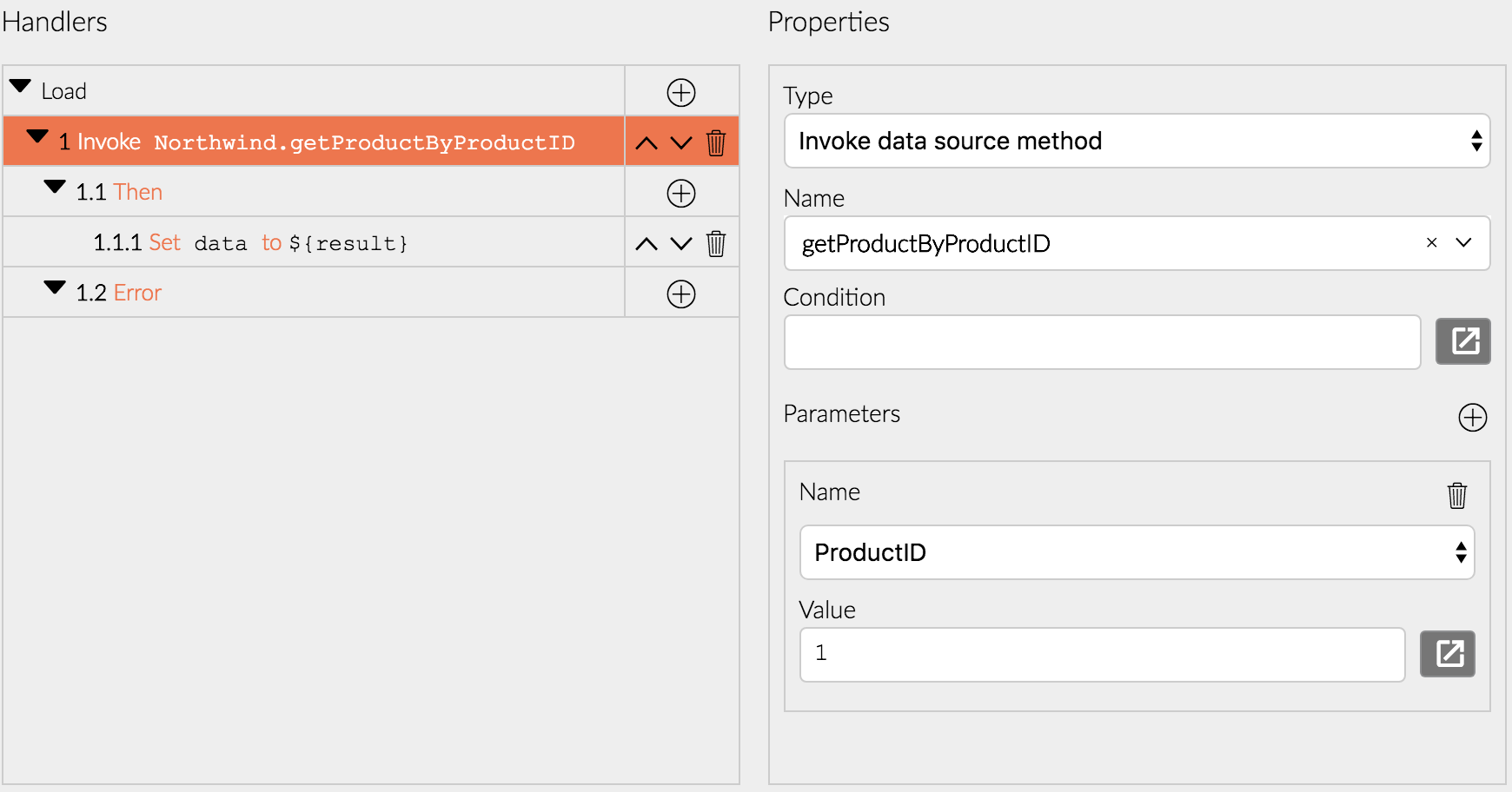 Alternatively just set a data item as a property e.g.
 {ProductName: 'Product Name'}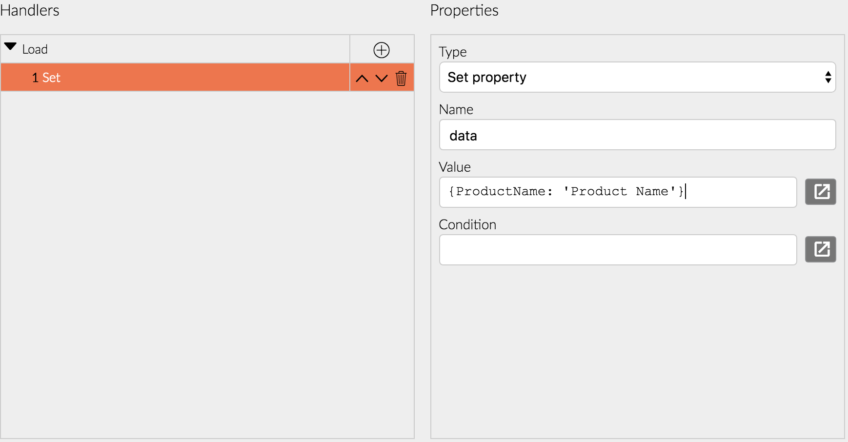
- Drag-and-drop a TemplateForm component from the Radzen toolbox.
- Add a Row component above the submit button. Set its bottom margin to
16pxto add some vertical spacing. Add two Columns in it. Set the size of the first column to3and the size of the second column to9. - Drag-and-drop a TextBox component in the second column. Set the Value property to
${data.ProductName}. This will data-bind this textbox to the ProductName property of the data item. The textbox displays the initial value ofdata.ProductNameand updates it whenever the user types something in it.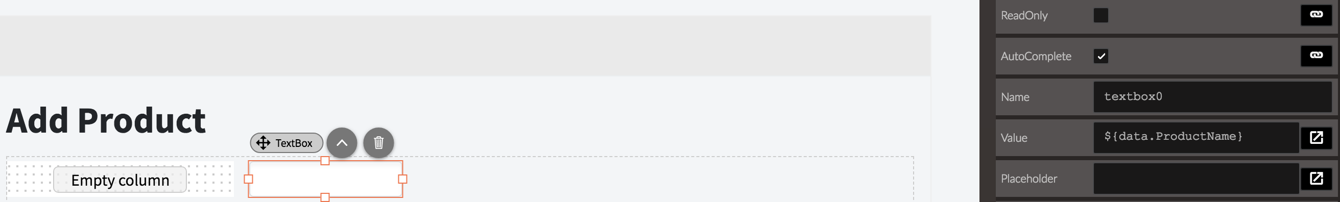
- Drag-and-drop a Label component in the first column. Set its Text property to
Product Nameand Component totextbox0. This will “link” the label with the textbox created in the previous step - when the user clicks the label the textbox will automatically focus.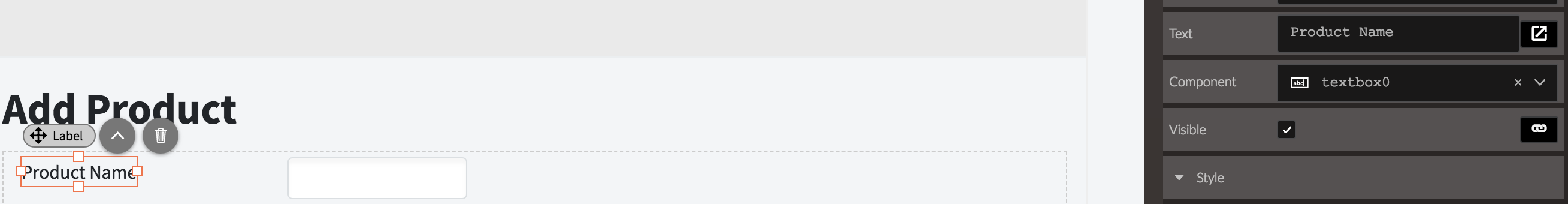
- Drag-and-drop a RequiredValidator component after the textbox. Set its Text property to
Product Name is requiredand Component totextbox0. The required validator will make sure the user enters a ProductName. If she doesn’t the Submit event of the form will not trigger and the Text of the validator will display.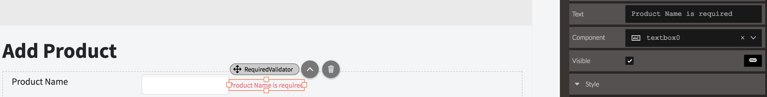
- Add an event handler for the Submit event. Optionally invoke a data source method that will insert a new entity or update an existing one.
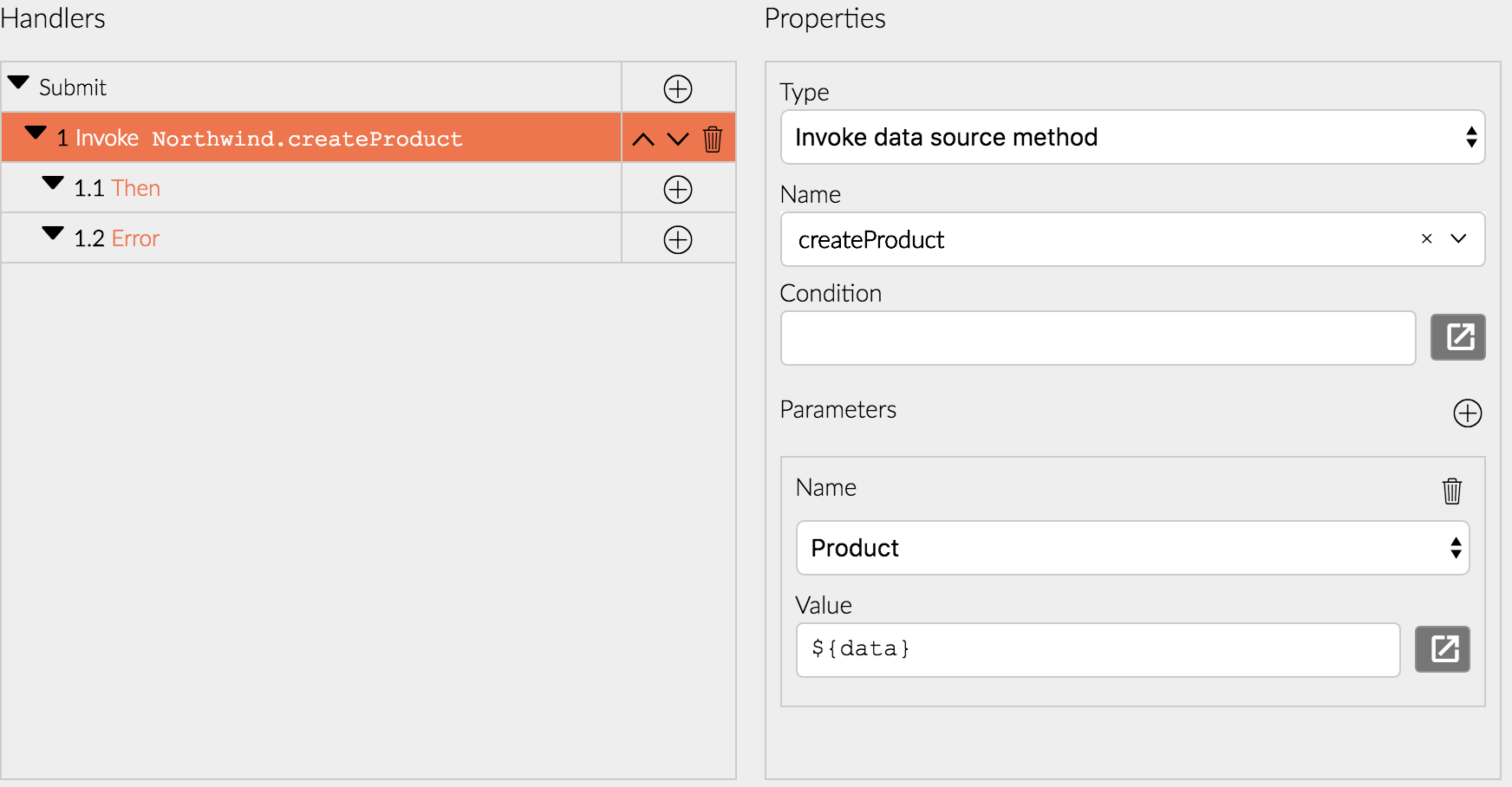
Note that in this case we are using the
Dataproperty we created in the first step instead of the event argument.
Blazor declaration
<RadzenTemplateForm Data="@(order)" Visible="@(order != null && canEdit)" TItem="Order" Submit="@Form0Submit">
    <ChildContent>
        <div style="margin-bottom: 1rem;" class="row">
            <div class="col-md-3">
            <RadzenLabel Text="User Name" Component="UserName" style="width: 100%;">
            </RadzenLabel>
            </div>
            <div class="col-md-9">
            <RadzenTextBox MaxLength="255" style="display: block; width: 100%;" Name="UserName">
            </RadzenTextBox>
            <RadzenRequiredValidator Component="UserName" Text="UserName is required" style="position: absolute;">
            </RadzenRequiredValidator>
            </div>
        </div>
        <div style="margin-bottom: 1rem;" class="row">
            <div class="col-md-3">
            <RadzenLabel Text="Order Date" Component="OrderDate" style="width: 100%;">
            </RadzenLabel>
            </div>
            <div class="col-md-9">
            <RadzenDatePicker DateFormat="mm/dd/yy" style="display: block; width: 100%;" Name="OrderDate">
            </RadzenDatePicker>
            <RadzenRequiredValidator Component="OrderDate" Text="OrderDate is required" style="position: absolute;">
            </RadzenRequiredValidator>
            </div>
        </div>
        <div class="row">
            <div class="col offset-sm-3">
            <RadzenButton ButtonType="submit" Icon="save" Text="Save" ButtonStyle="primary">
            </RadzenButton>
            <RadzenButton ButtonStyle="light" Text="Cancel" Click="@Button3Click">
            </RadzenButton>
            </div>
        </div>
    </ChildContent>
</RadzenTemplateForm>