Components (Blazor)
Components are a fundamental building block of Radzen application. Every page consists of components: the page title is displayed in a Heading component, the navigation is handled by the PanelMenu which is inside a Sidebar component. Your users browse the application data displayed in a DataGrid component and update it via the TextBox, DatePicker and other input components.
Radzen components are available in the toolbox. To use components you drag them from the toolbox and drop them on your page.
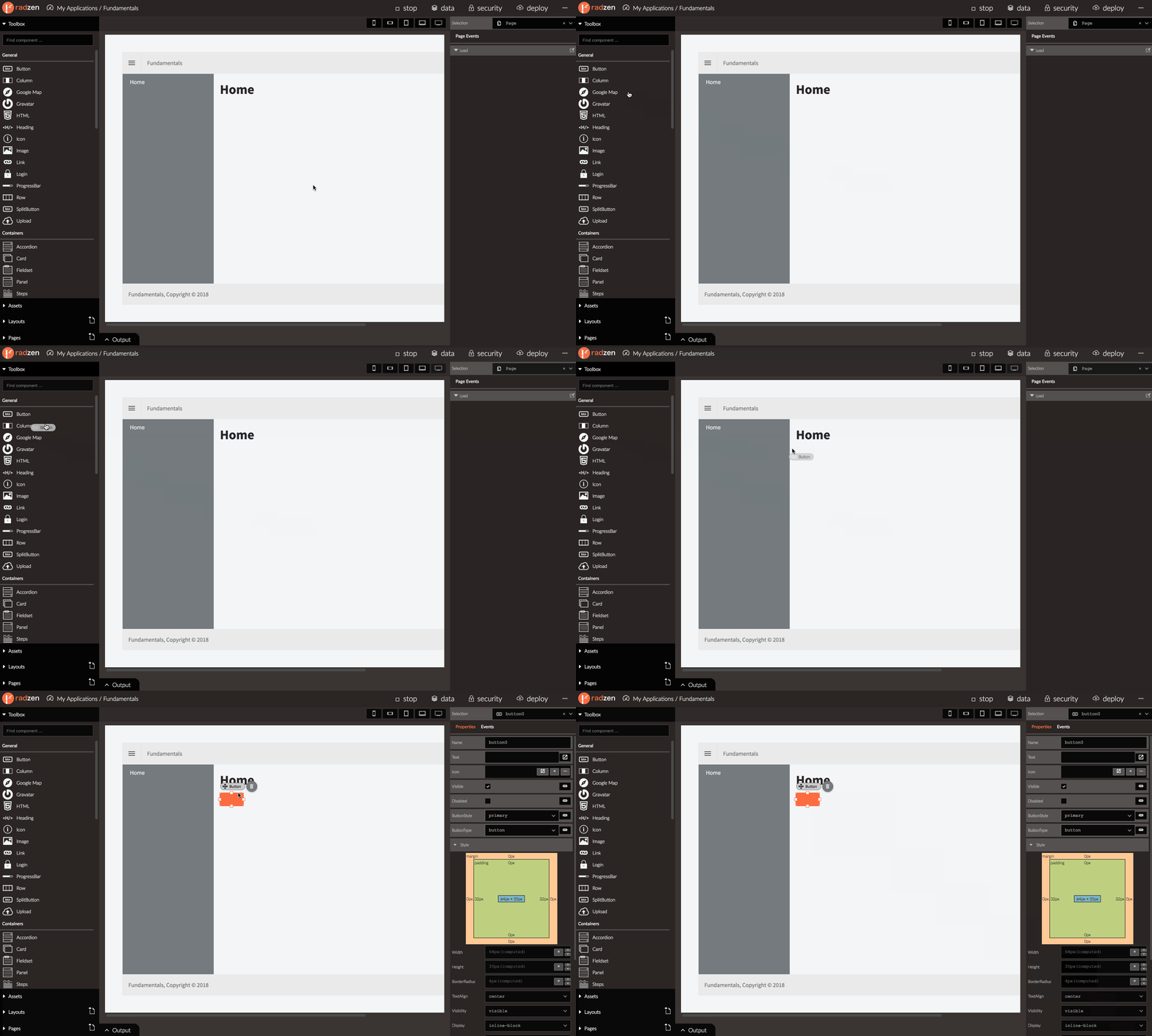 Clicking a component selects it in Radzen and reveals its properties in the property grid.
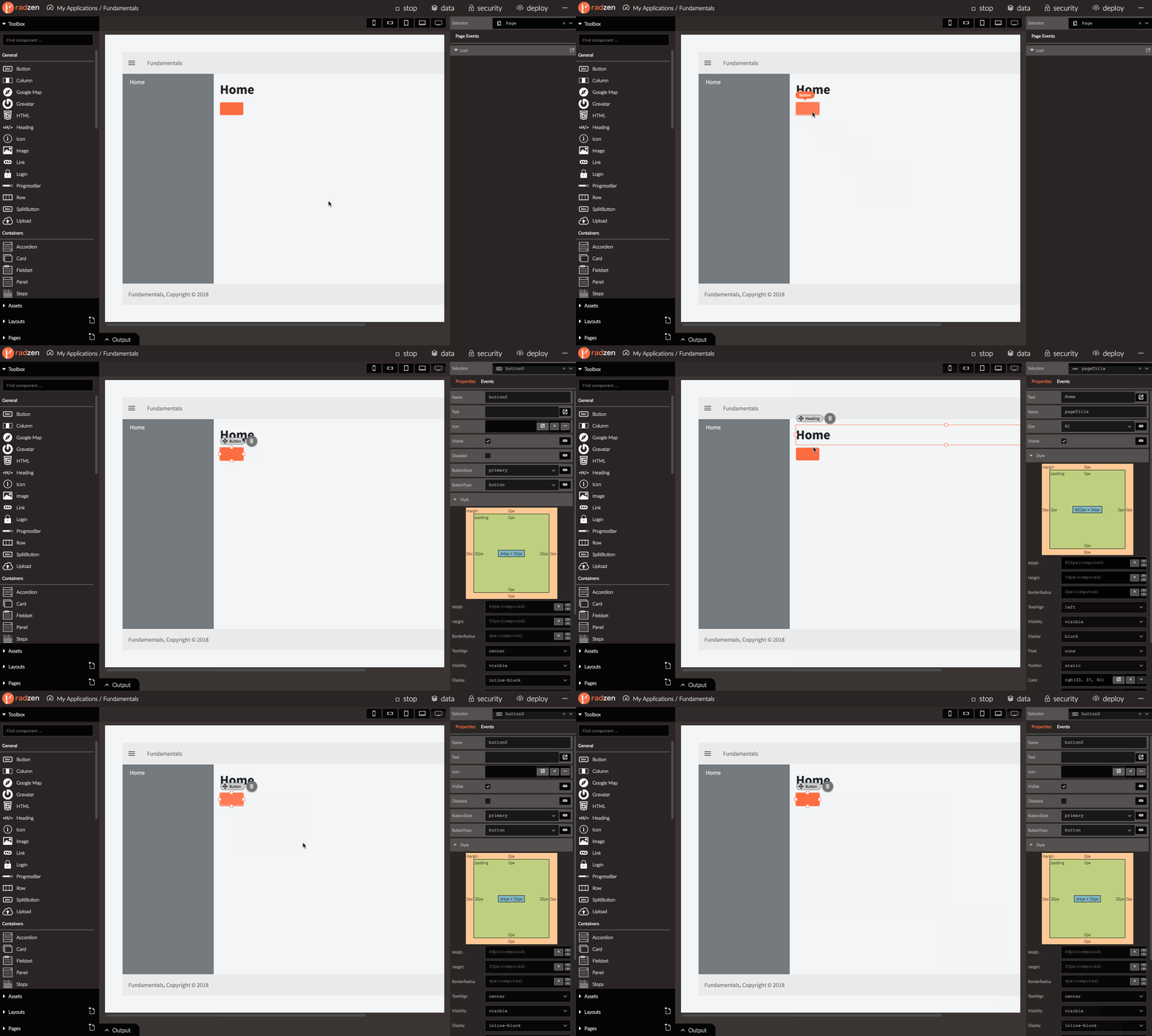 Another method to select a component is via the Selection dropdown in the top right cornder of Radzen.
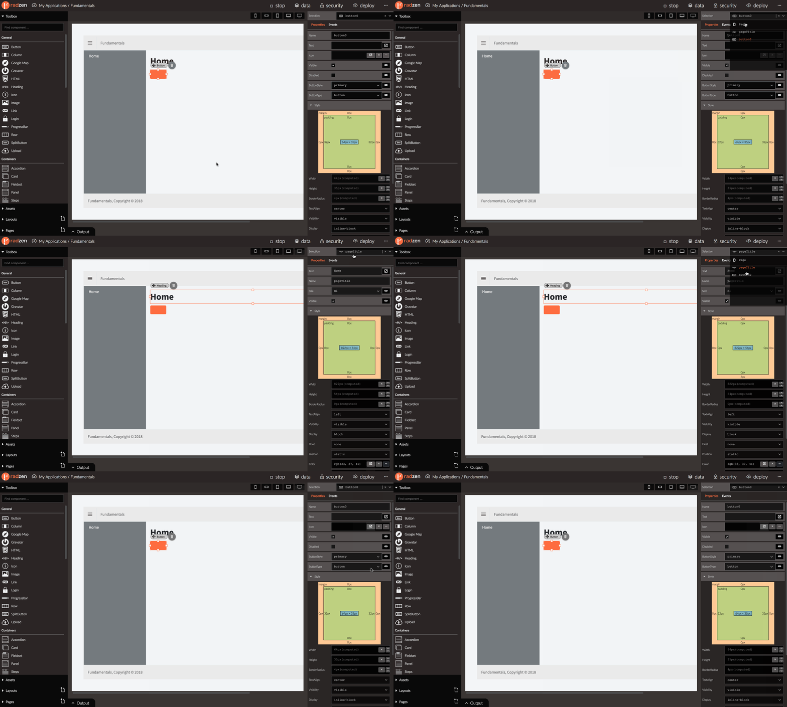
Properties
Every component has a set of properties that control its behavior. Some properties enable or disable certain component features, other specify the component appearance (width, height).
Some component properties can be data-bound to page properties. This allows you to display your application data and to configure your components based on user actions by handling events.
Check the Properties article for additional info on page properties.
Here is a list of the properties that most components share:
Name
Every component has a Name which should be unique in the current page. The Name property is one of the few properties that cannot be data-bound to a page property because the component name should be a constant known during code generation.
Visible
The Visible property controls whether a component appears on the page or not. By default it is set to true.
Setting it to false will hide the component. The Visible property can be data-bound to a page property which
will allow you to hide or show certain component based on application data or user actions.
Here is a quick demo showing how to hide a TextBox when the user clicks a Button.
- Create a page property called textBoxVisible and set it to
true. Check Create property for tips. - Drag and drop a TextBox component. Set its Visible property to
${textBoxVisible}. This data-binds the Visible component property to the textBoxVisible page property. - Drag and drop a Button component. Set its Text to Hide. Handle its Click event and add a Set property action. Set Name to textBoxVisible and Value to
false. Clicking the button sets textBoxVisible property tofalsewhich in turn hides the button.
Attributes
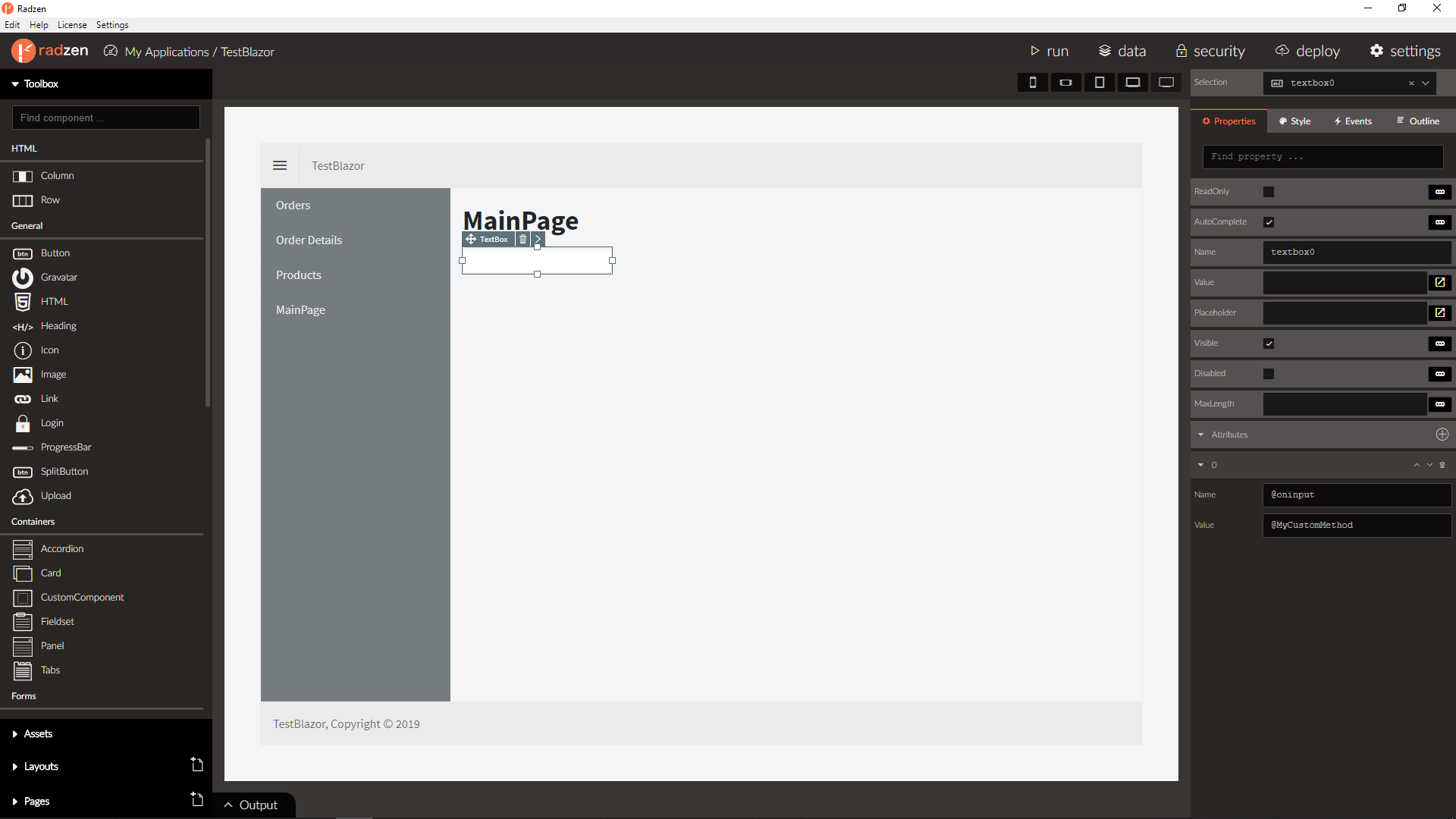
The Attributes property allows to to specify custom attributes which are not available as a built-in properties. Those are usually HTML attributes and events.
Custom events
To handle the input DOM event of a TextBox add a new attribute by clicking the “+” button. Set Name to @oninput
and Value to @MyCustomMethod. The @oninput syntax is a special Blazor syntax for handling DOM events.
Radzen will generate the following code.
<RadzenTextBox @oninput="@MyCustomMethod">
</RadzenTextBox>
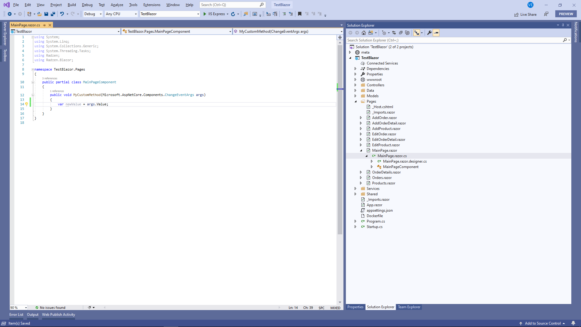
The actual event handler (MyCustomMethod) should be defined in the xxx.razor.cs file where xxx is the name of the page.
void MyCustomMethod(Microsoft.AspNetCore.Components.ChangeEventArgs args)
{
    var value = args.Value;
}
Custom attributes
A common use case is to set a custom CSS class to a Radzen component. To do so add a custom attribute with Name set to class and Value set to your desired class name e.g. my-class.
Radzen will generated the following code:
<RadzenTextBox class="my-component">
</RadzenTextBox>
Text
The Text property makes the component display certain value - either a literal (e.g. Hide, Show) or a page property (${text}, ${textBoxVisible}, ${counter}).
Check Display property value for further info.
Value
Input components have a Value property. It has “special powers”. It can only be data-bound to a page property - it doesn’t accept literal values. Also it updates automatically the page property it is data-bound to. You can check Get user input for more details.
Data
Components that display data do that via the Data property. Those are the DataGrid, DropDown, Scheduler, DataList and many more.
Style
This is a complex property - it has sub properties that control the visual appearance of the component. For example Width or Height.
The Style property maps to the style HTML attribute.
Events
Some components trigger events in certain conditions - for example when the user interacts with them. For example typing in a TextBox triggers its Change event. Clicking a Button triggers the Click event. Check Event handling for additional info about event handling in Radzen.
Categories
Radzen groups components in the following categories:
-
General
Those are general purpose components that are commonly used: Button, Row, Column, Icon, Image, Link and more.
-
Containers
Components that contain other components. Accordion, Card, Fieldset, Panel, Steps (wizard) and Tabs.
-
Forms
All input components are there: TextBox, CheckBox, DatePicker, DropDown, ListBox and more.
-
Data
Those components display data (usually coming from a data source such as a database): DataGrid, DataList, Tree, TreeGrid and more.
-
Validators
Those validate your user input and come in hand with forms: RequiredValidator, LenghtValidator and more.